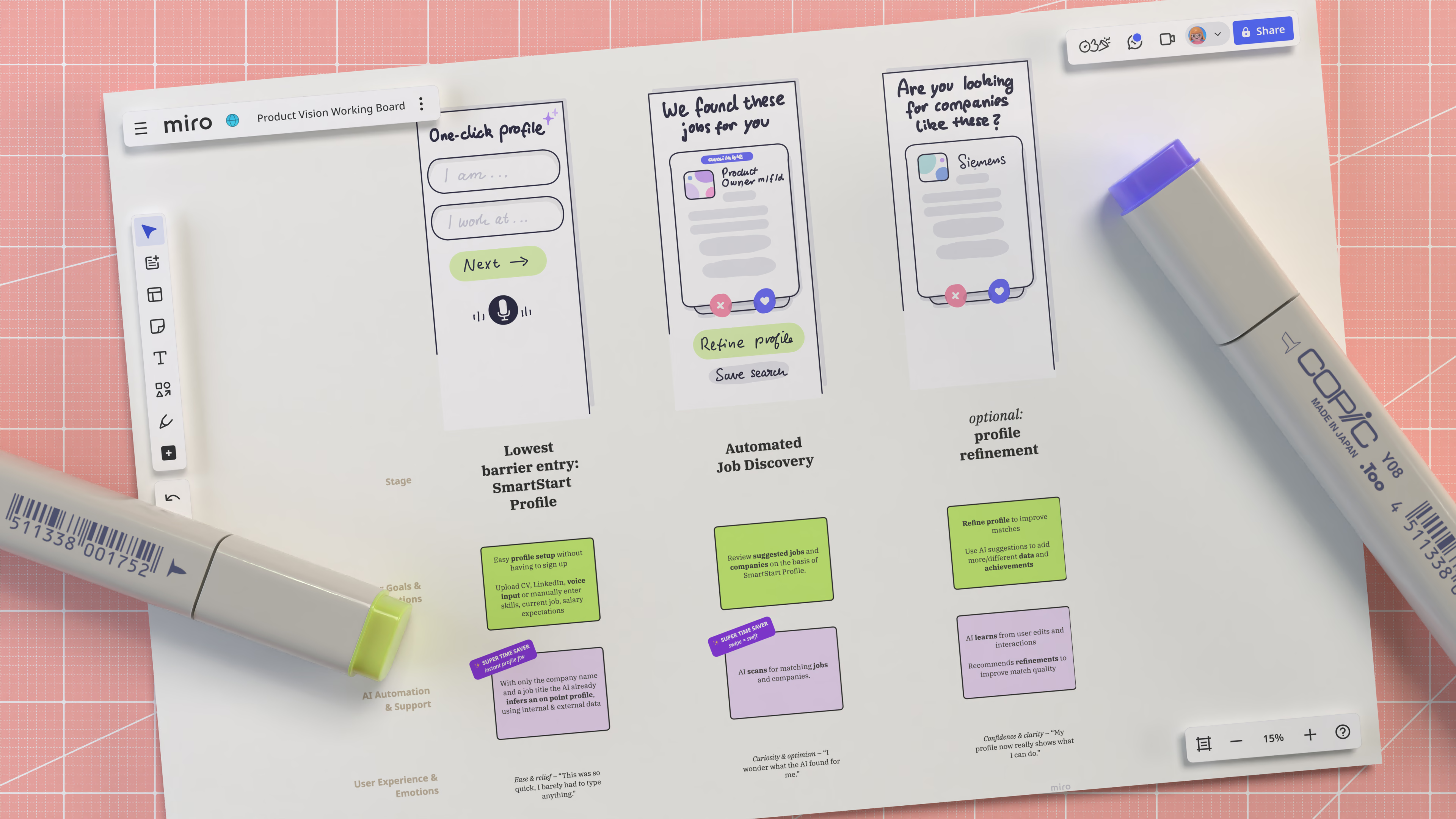
To the drawing board
Two days of focused vision work with leaders from engineering, product, design, and marketing, facilitated by the SVP of Product. I helped translate fresh user-research insights into concrete product directions — focusing on where AI could meaningfully reduce effort across the hiring journey.
A whole heap of vision — made watchable
To make an abstract vision tangible, I created a series of animated screens — a shared artefact that helped leadership align, teams converge, and roadmap decisions take shape.
Getting real — implementation
I kept design and engineering aligned from concept into build — defining specs, resolving edge cases, and collaborating daily to ship the fastest viable version of the shadow-profile builder.
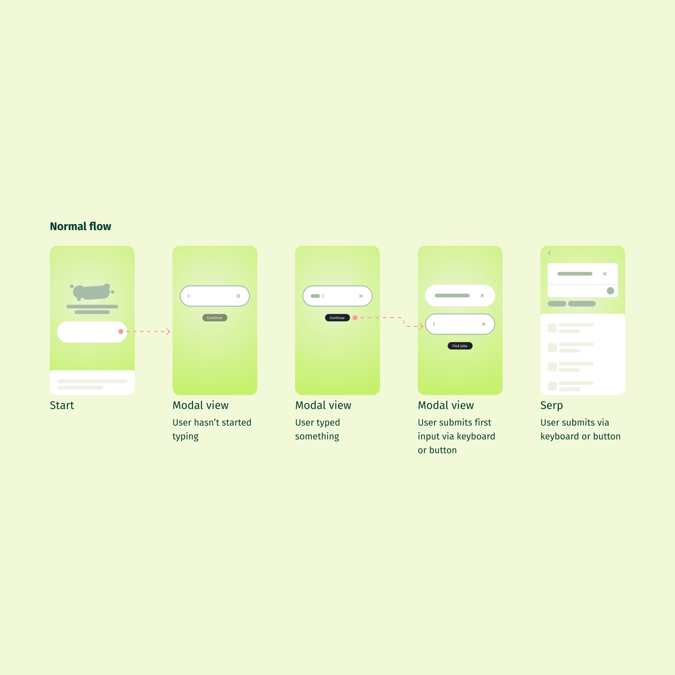
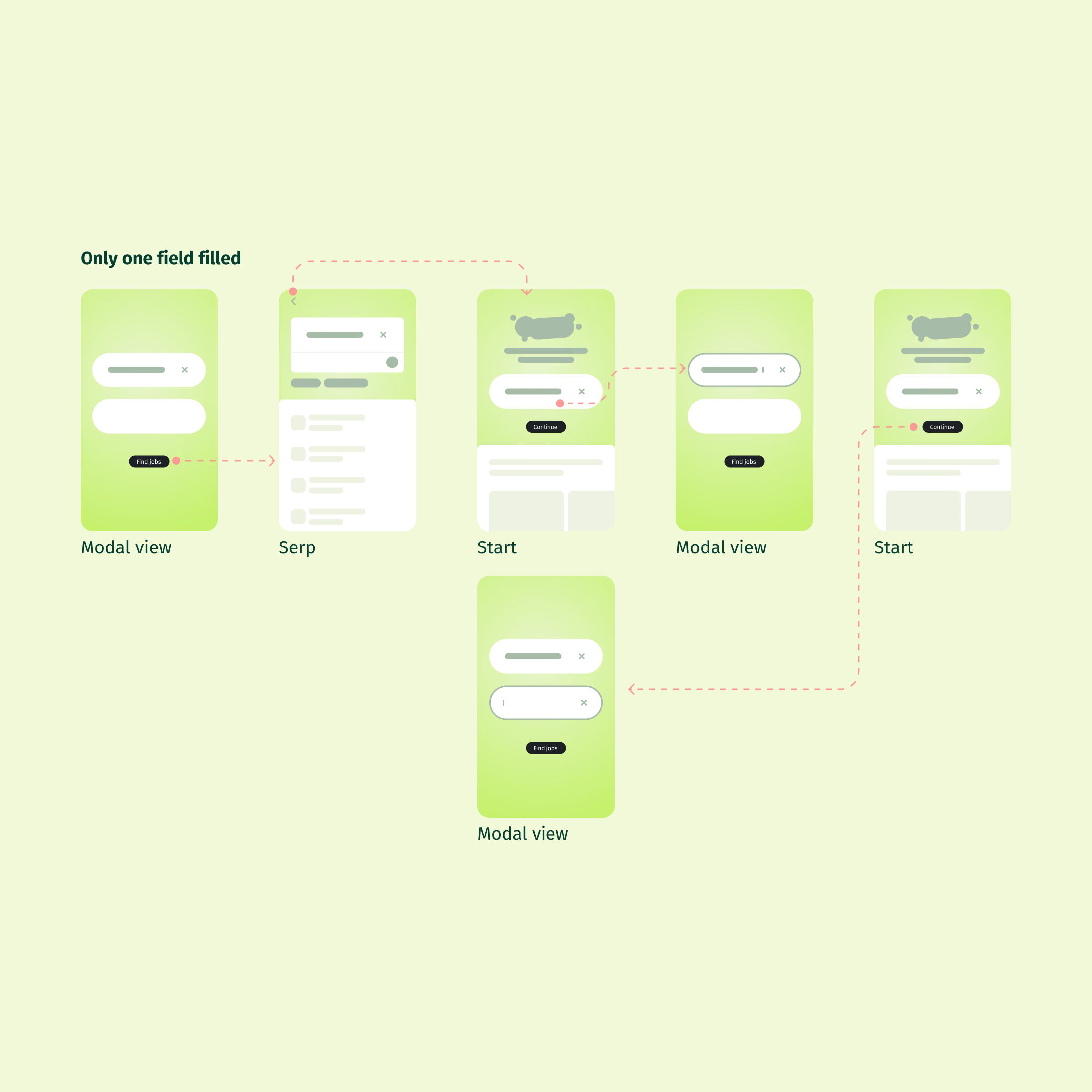
Specs don’t stop at visuals — they define behaviour.
Even two input fields require decisions: when values persist, how clearing behaves, and when additional inputs appear. These rules are not edge cases — they are the product.
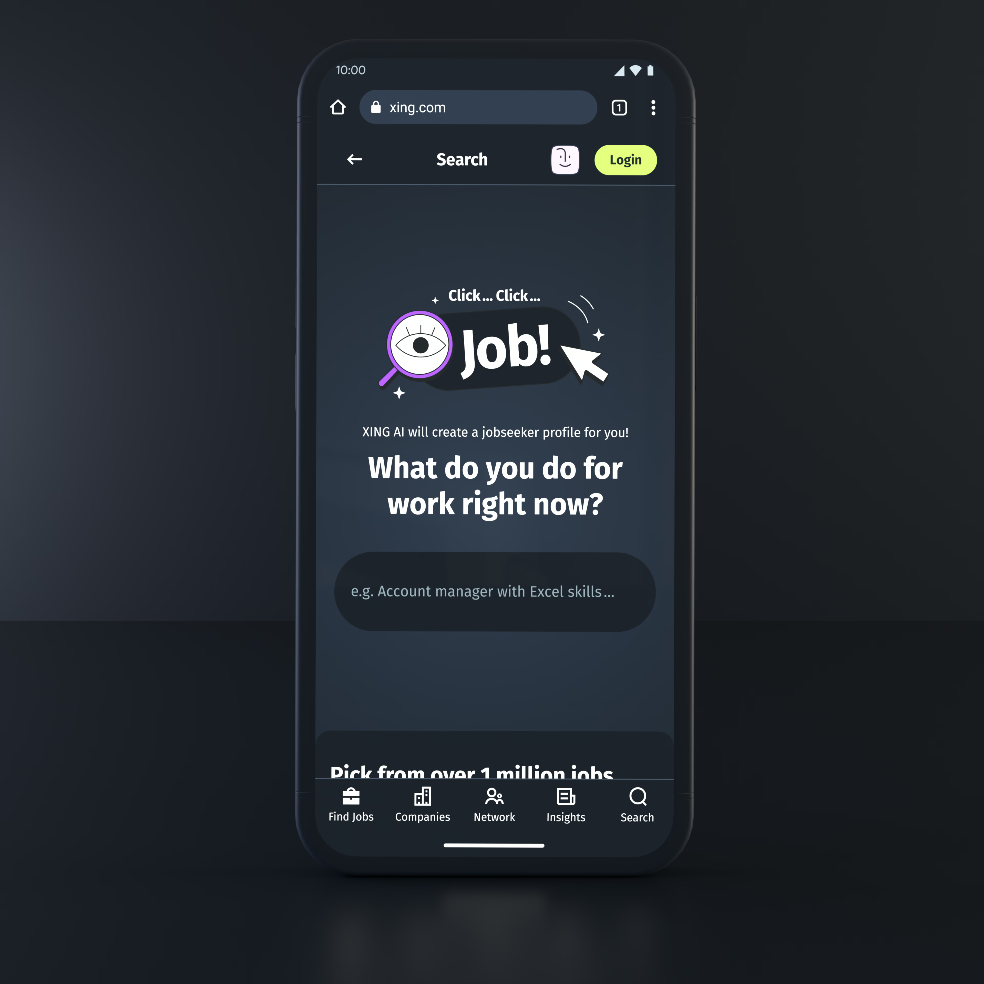
Pssst...for the people on the dark side of the moon
Dark mode changes how interfaces communicate hierarchy, contrast and depth. Instead of adapting designs later, we built it into the system from the start — defining both modes in the specs to ensure consistency and clarity.
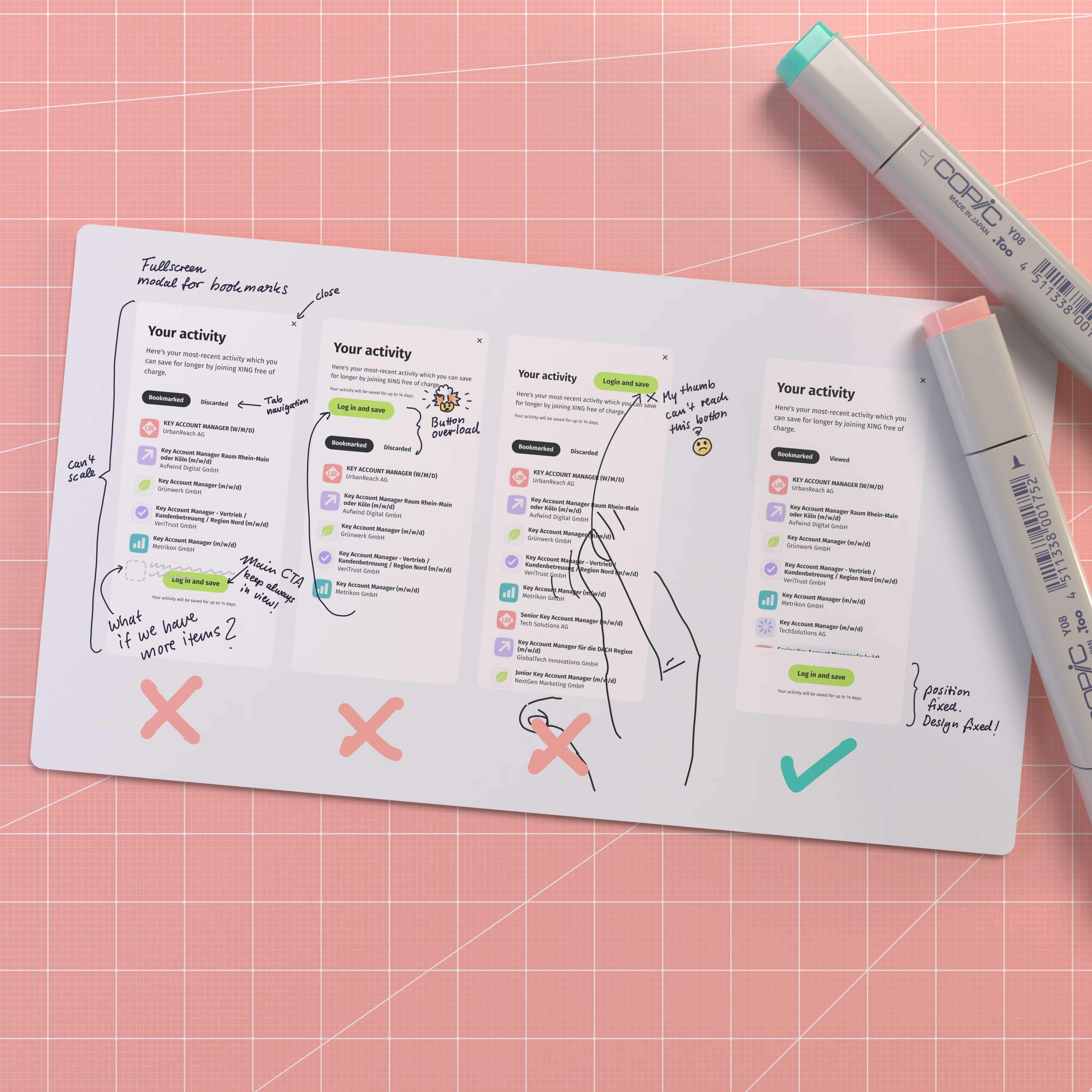
Show where you didn’t go
Instead of hiding discarded directions, we documented them. This made decisions easier to explain, prevented repeated loops, and helped the team align faster around the path forward.
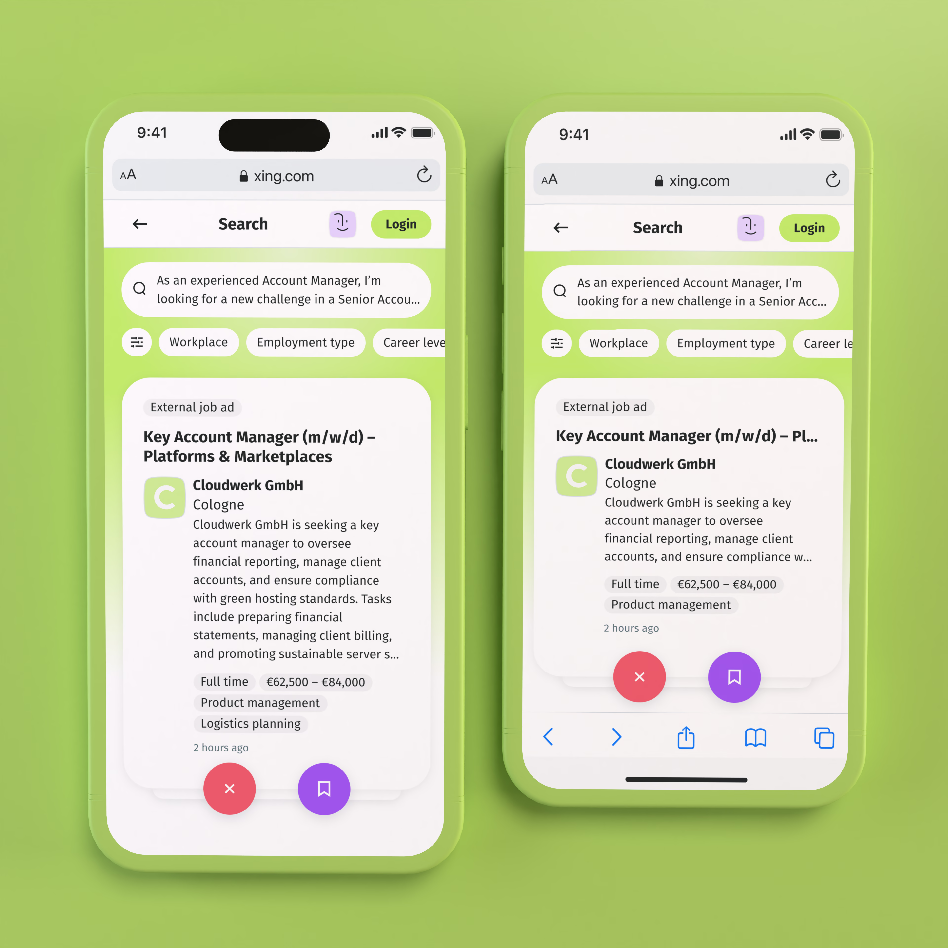
Responsive design isn’t just width — it’s height.
For swipeable cards, height introduces a real trade-off: fixed layouts waste space, flexible ones lose content. We made cards height-aware — maximising content while defining clear prioritisation rules.🤓
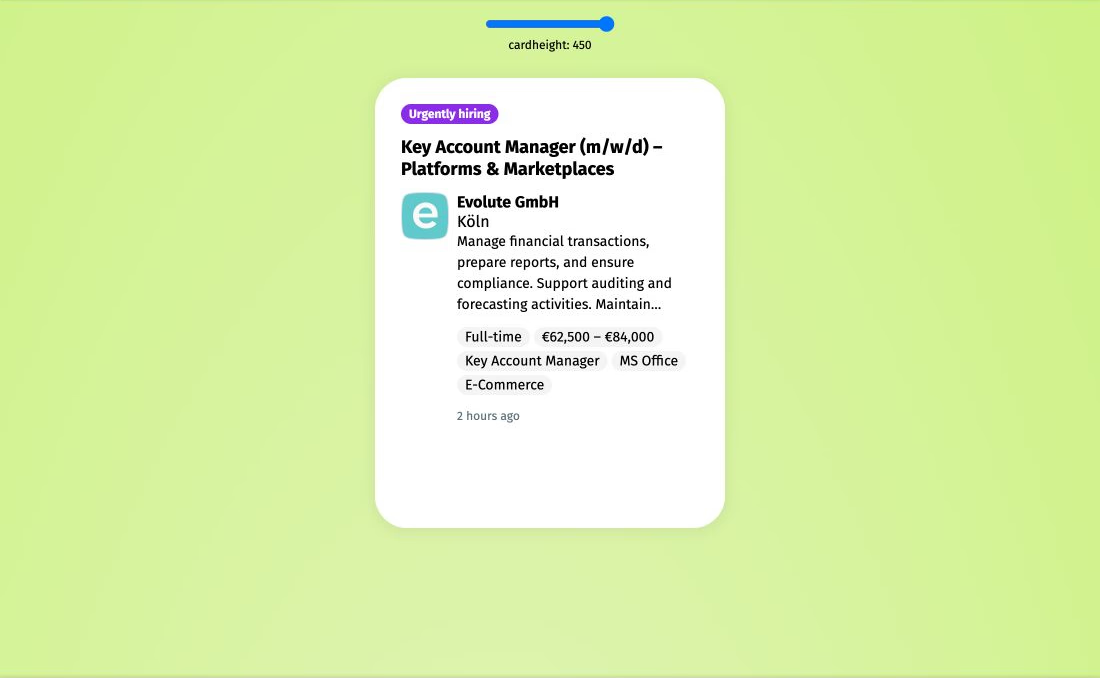
I built a CodePen prototype to define truncation logic, test edge cases, and align design and engineering on consistent behaviour across screen heights.