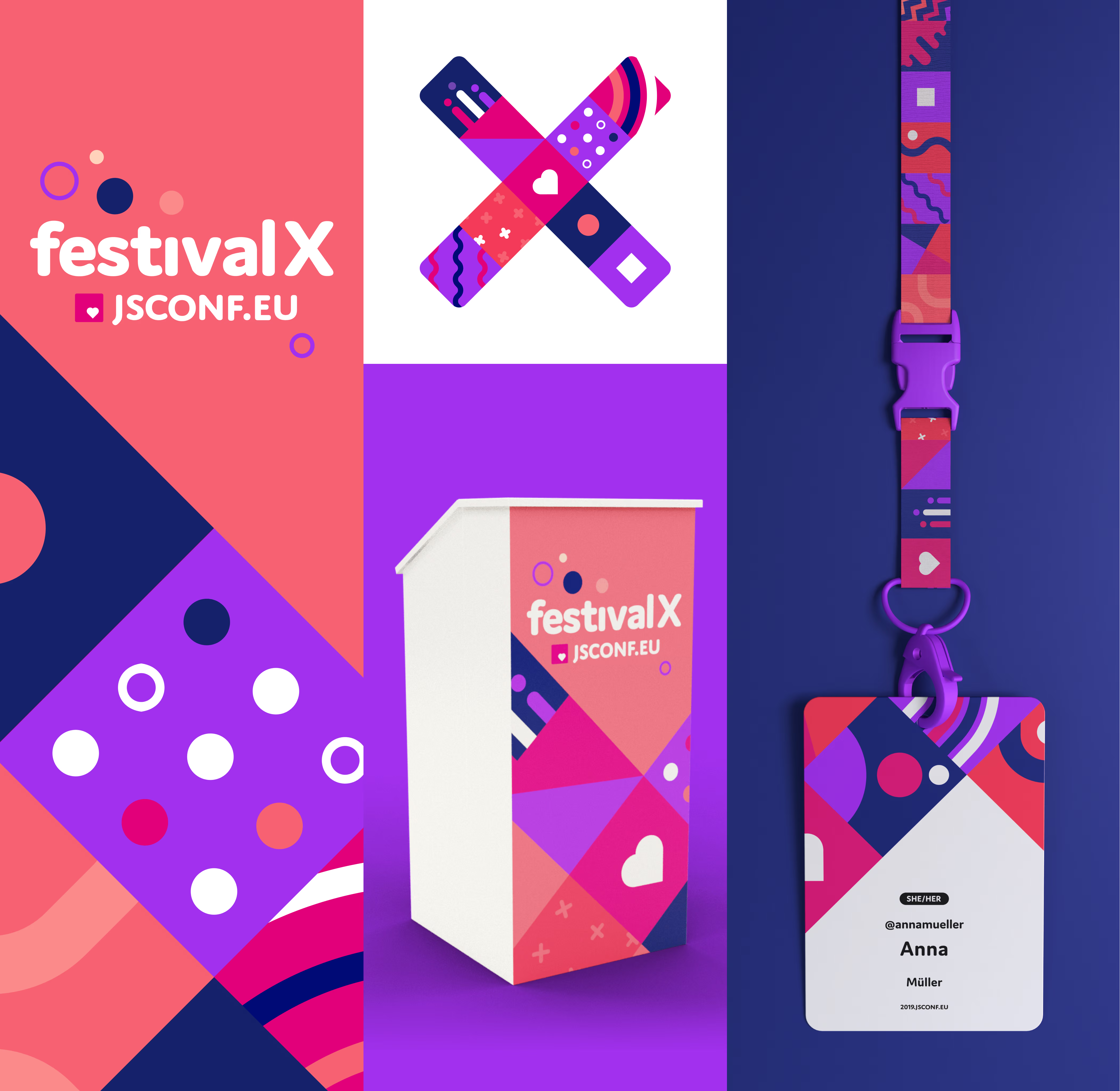
Making an inclusive conference spirit visible
What made JSConf EU special was not just the code, but the people and the culture around it. We translated that into an identity full of positive energy, playfulness and human warmth.
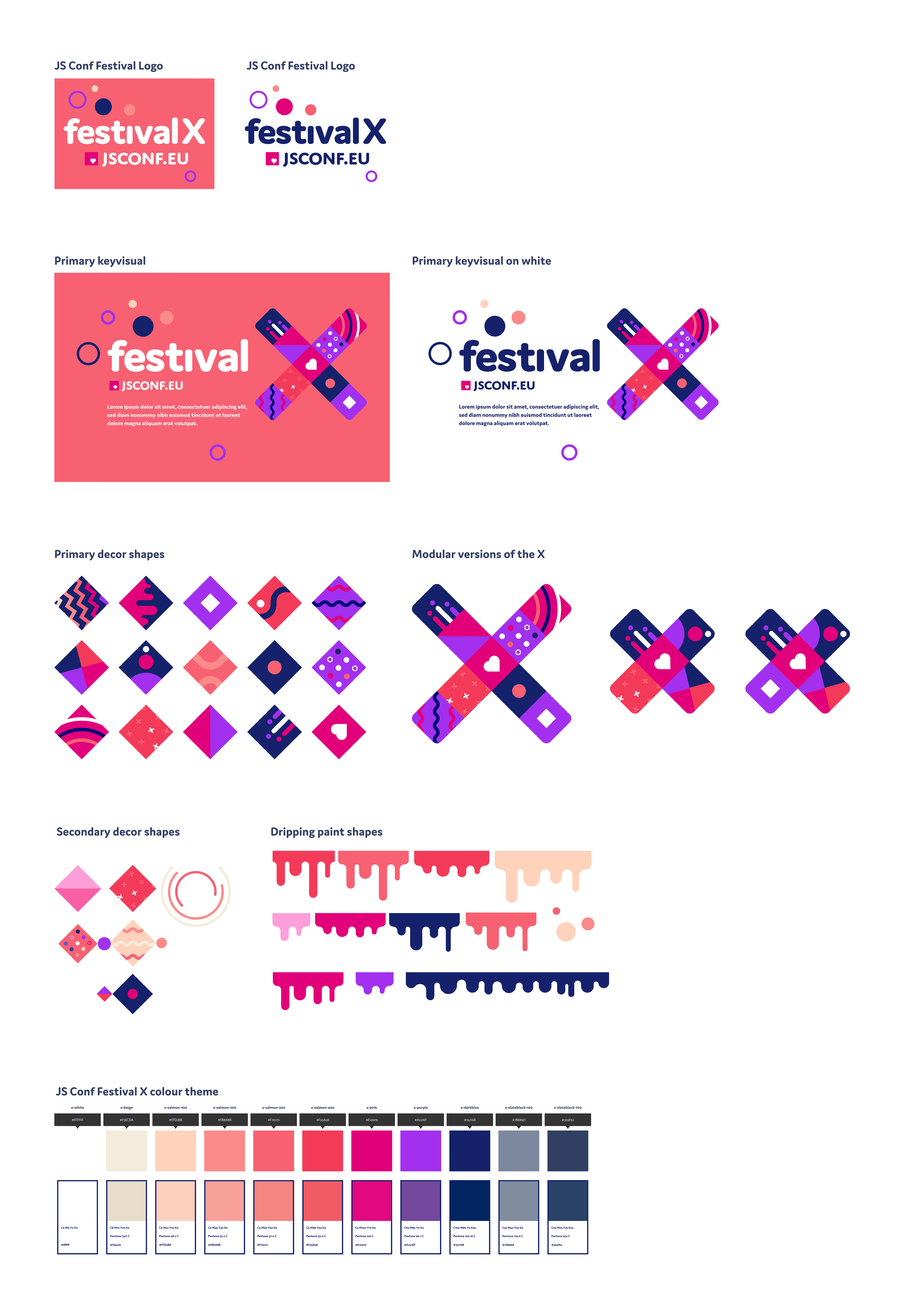
A building kit for every surface
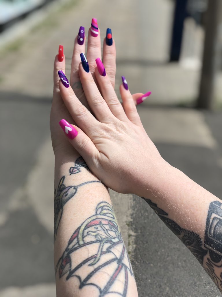
The Festival X identity was built from modular squares, making the key visual easy to adapt across formats, surfaces and production needs. For a conference with dozens of partners and branded touchpoints, I created a building kit that explained the system, kept production consistent and still invited play. The result was one cohesive visual world across signage, screens, badges, merchandise, stage graphics and everything in between.
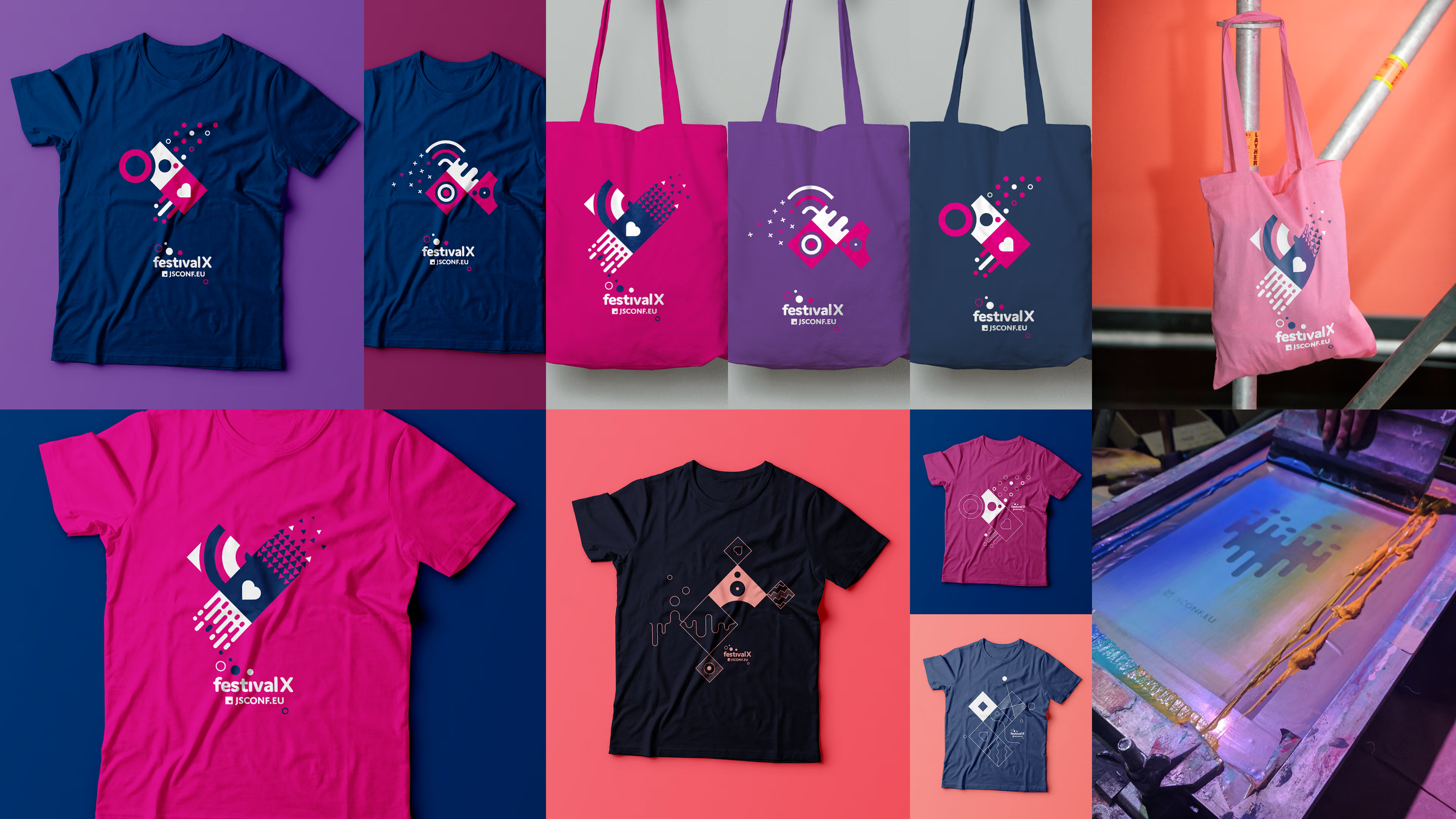
Sustainable conference merch, printed on demand
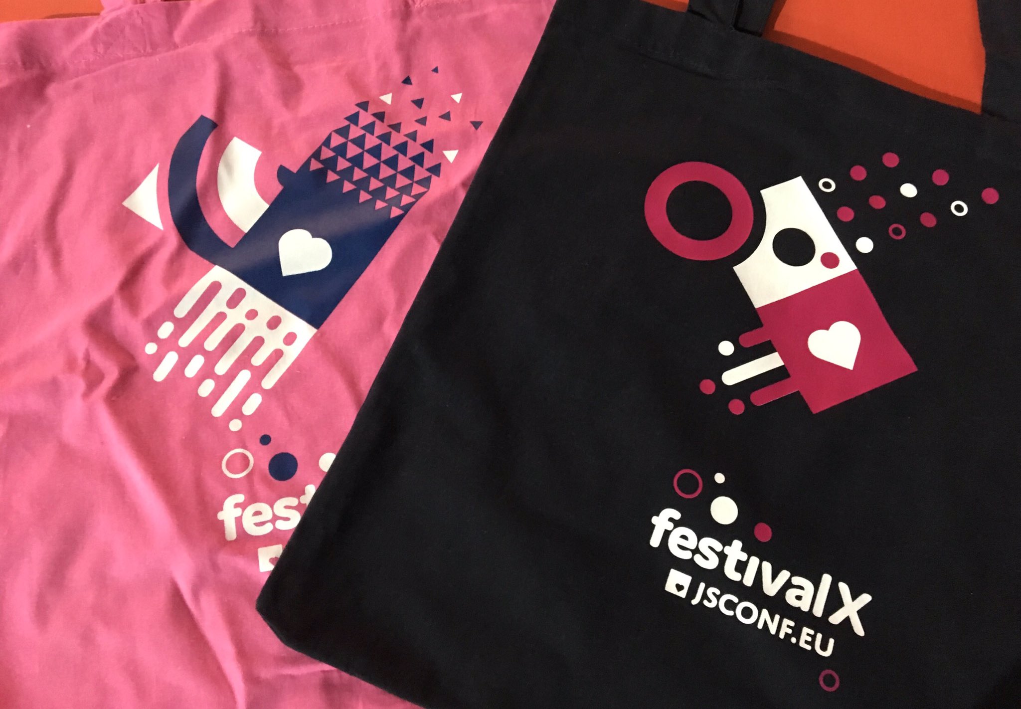
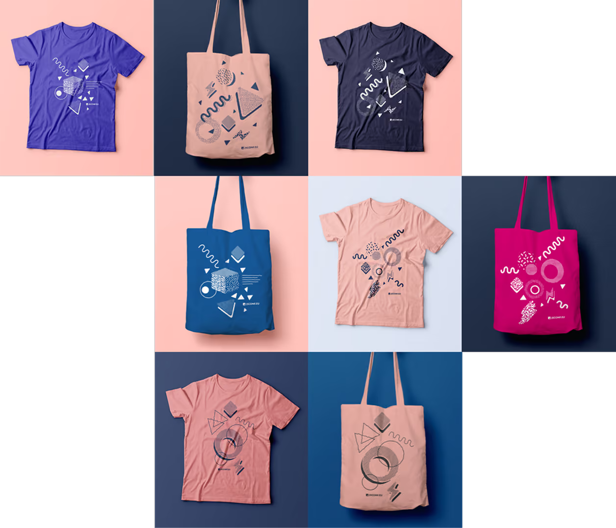
Instead of pre-producing hundreds of shirts in fixed cuts, we moved to on-site silkscreen printing. Attendees could bring the textile that suited them best — from favourite shirts to shoulder bags — or use a free tote. I designed multi-colour screen prints that made the production process part of the experience. The result was more personal, more flexible and almost zero-waste.
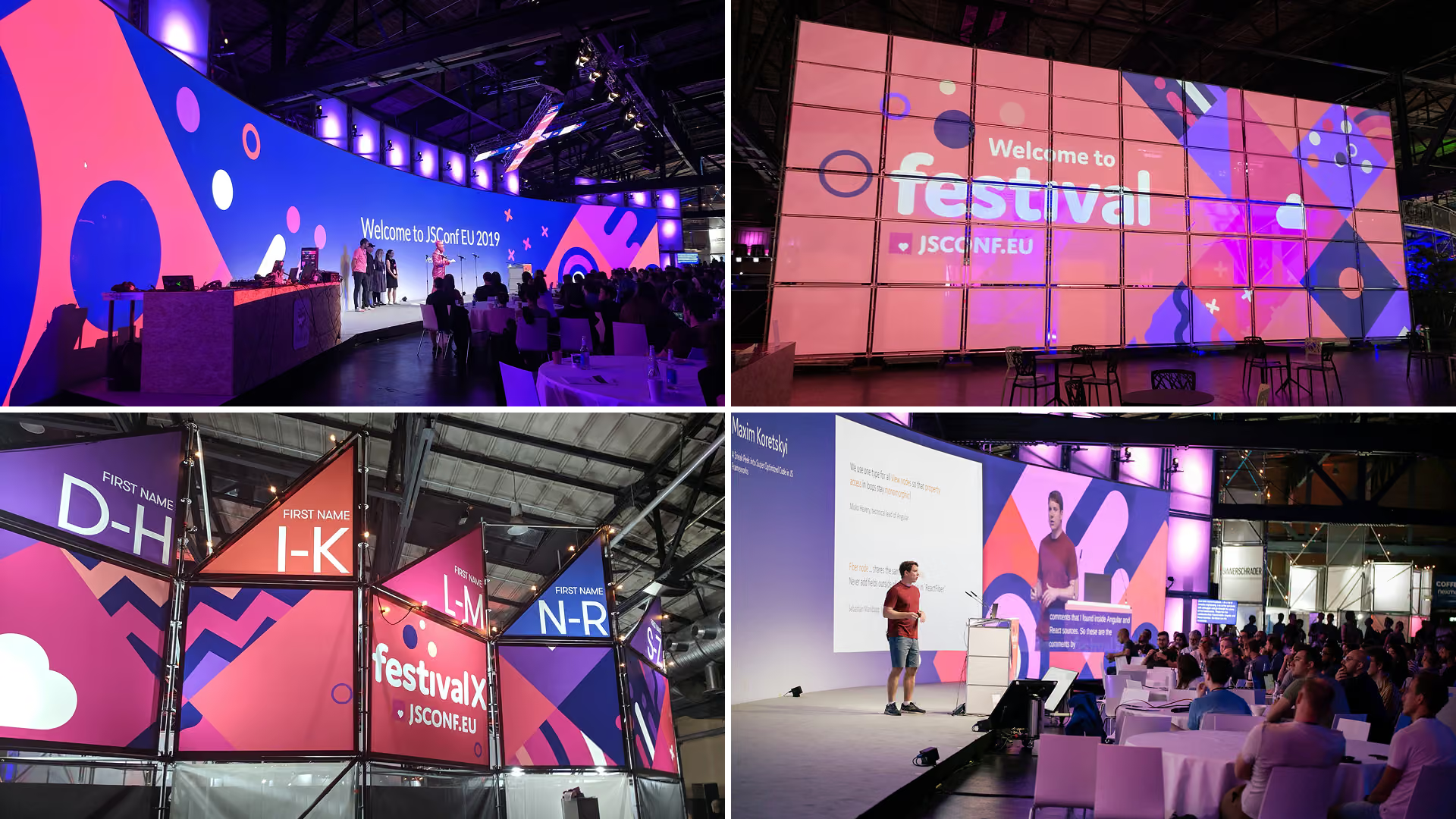
Designing for a 54-metre curved canvas
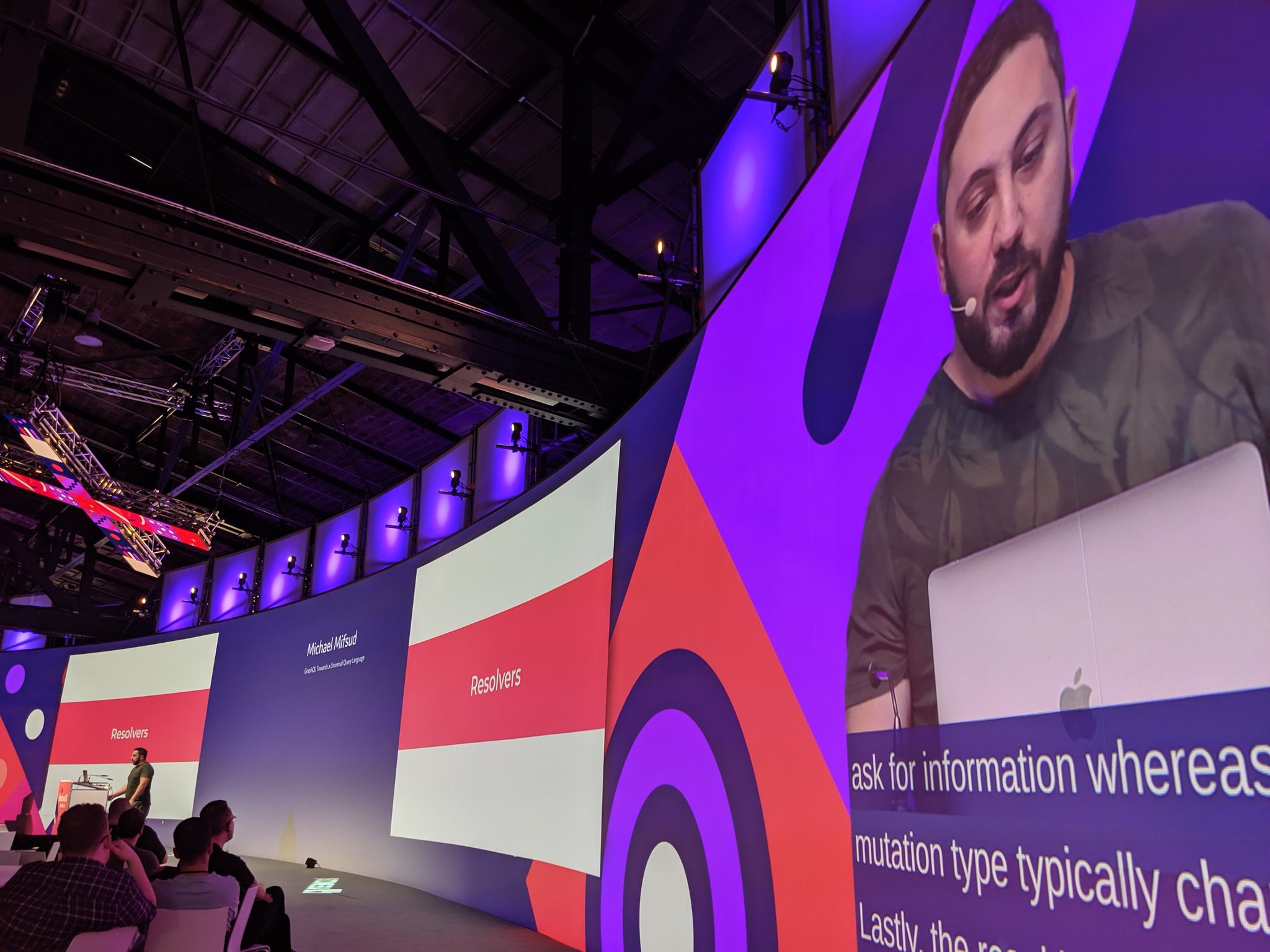
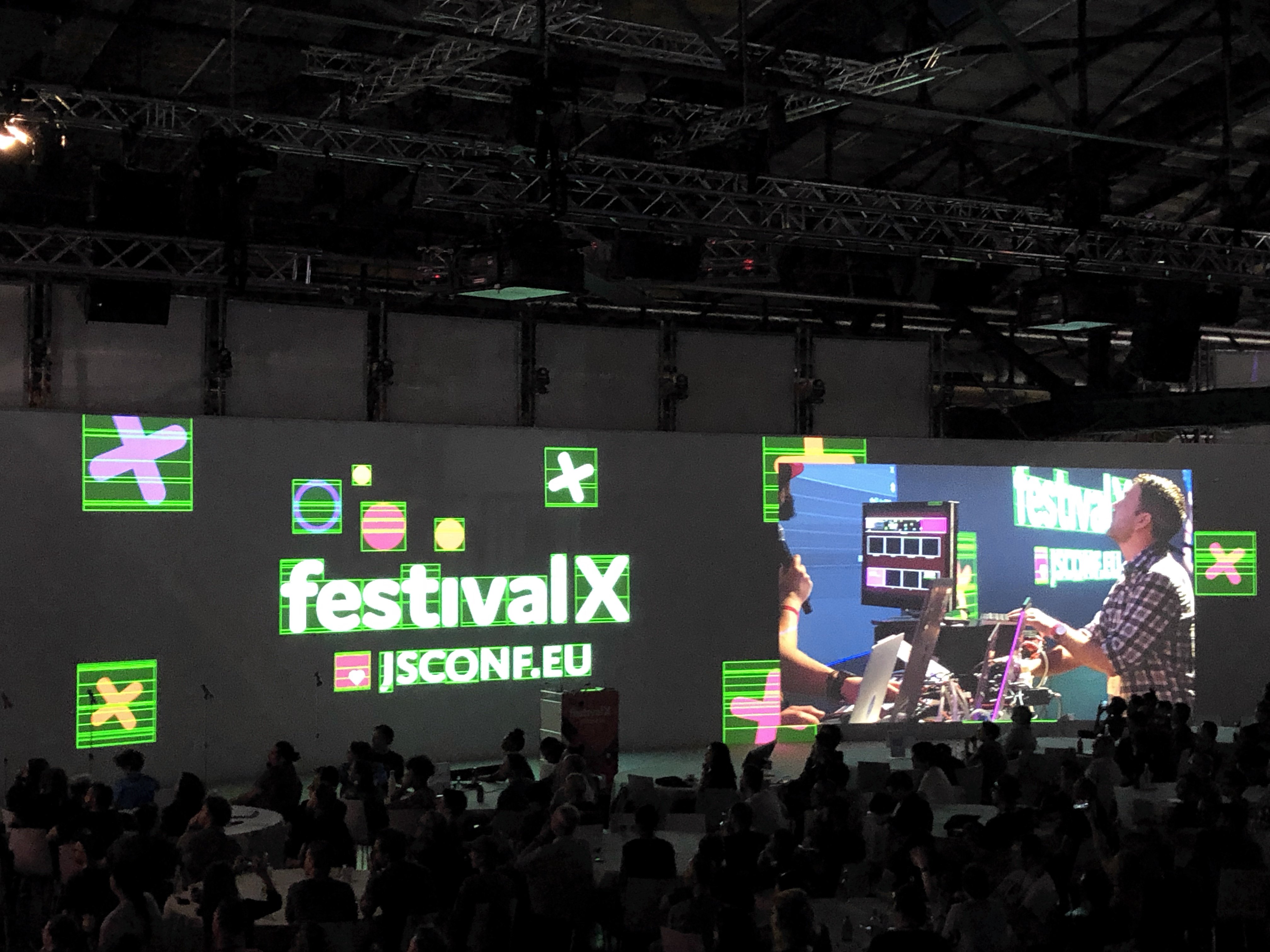
The main stage was a design challenge in itself: 54 × 6.5 metres wide, fed by source files and web visuals at 8256 × 1006 pixels. It was a format too wide to fully imagine on a normal screen — until it was projected at scale. The technical production team used multiple projectors to create the full panorama, while chroma keying allowed the live camera image of the speaker to be cut out and composited directly onto the brand visuals. The result was incredibly immersive.
Designing for a 54-metre curved canvas
The main stage was a design challenge in itself: 54 × 6.5 metres wide, fed by source files and web visuals at 8256 × 1006 pixels. It was a format too wide to fully imagine on a normal screen — until it was projected at scale. The technical production team used multiple projectors to create the full panorama, while chroma keying allowed the live camera image of the speaker to be cut out and composited directly onto the brand visuals. The result was incredibly immersive.
The X — A key visual made physical
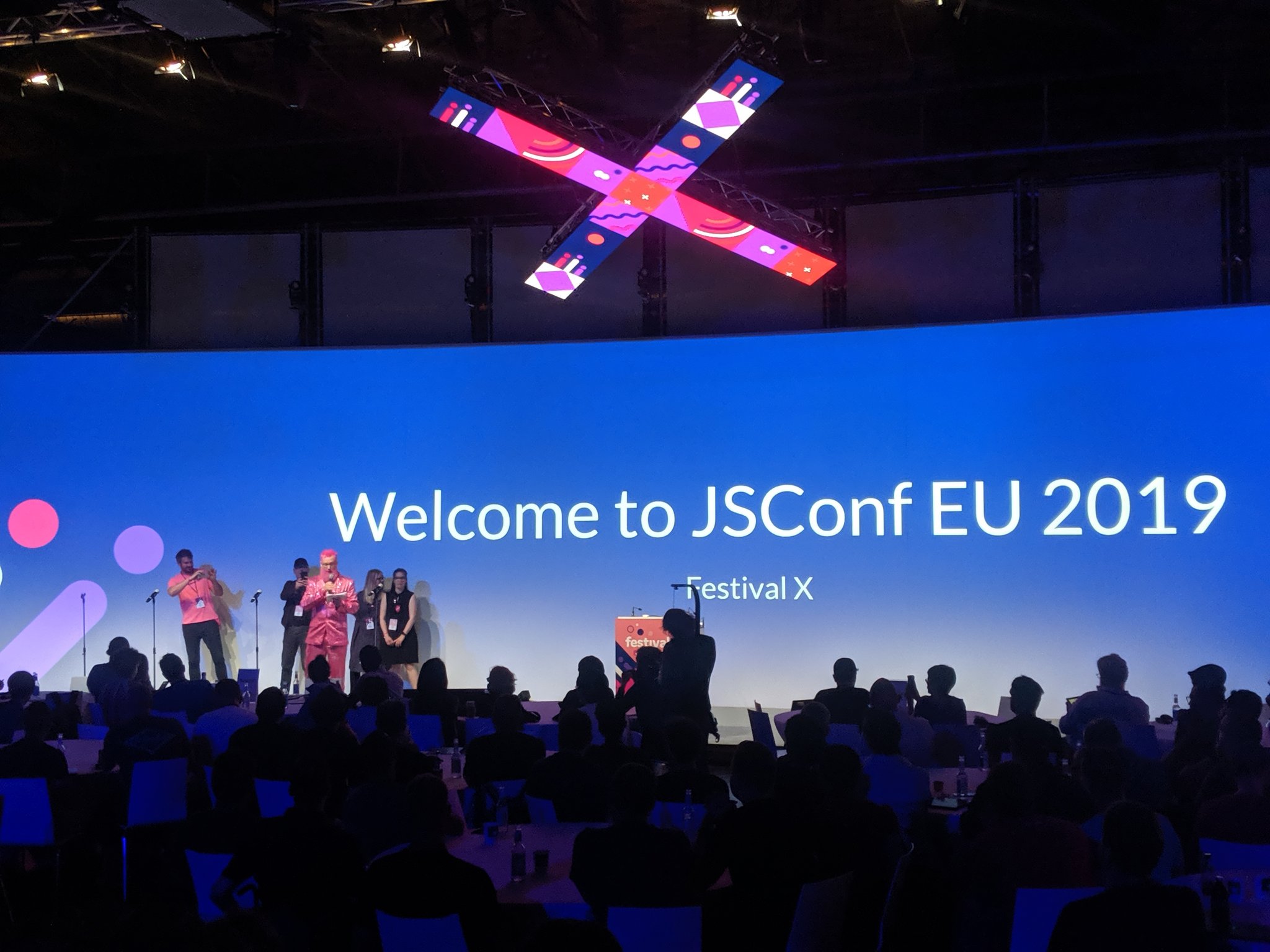
The Festival X logo became a custom stage installation built from 17 LED panels — each one showing one animated square from the visual identity. Suspended above the stage, the X could be lowered in darkness and tilted in different directions, turning the conference identity into a live, physical moment. In true JSConf spirit, the animation signal came from a CodePen I built with Lottie. We shared it with the community, so people could fork it, create their own version and have their animation projected live at the conference.