From redesign…
Frameworks don’t create impact — decisions do
What separates impact from cargo cult is knowing when to use which tool. We turned assumptions into hypotheses and prioritised uncertainty — focusing user testing where we knew least.
Uplift 20% How might we move users from networking to finding jobs?
We reclaimed space from cross-site navigation and gave it to the filters users needed most. The filter bar stayed reachable while scrolling, made active selections visible, and helped users narrow large result sets without breaking their search flow. On iOS, filter usage increased by 20% — an important step towards more relevant results and stronger click-through.
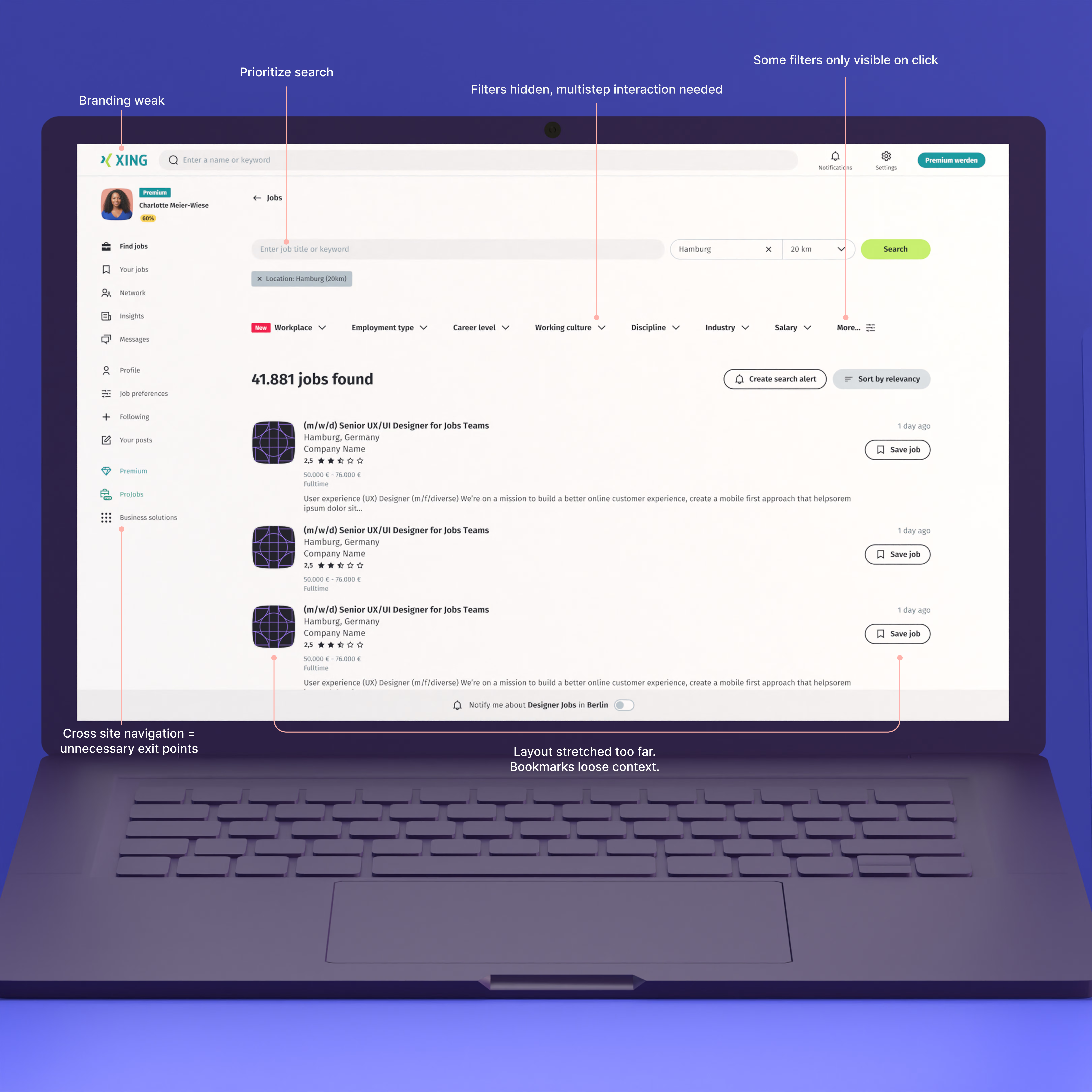
Problem: Search competed with everything
The old page treated search as one element among many. Navigation, branding and secondary actions pulled attention away, while filters were hidden behind extra clicks or unclear labels. Users rarely discovered the ways they could narrow thousands of results.
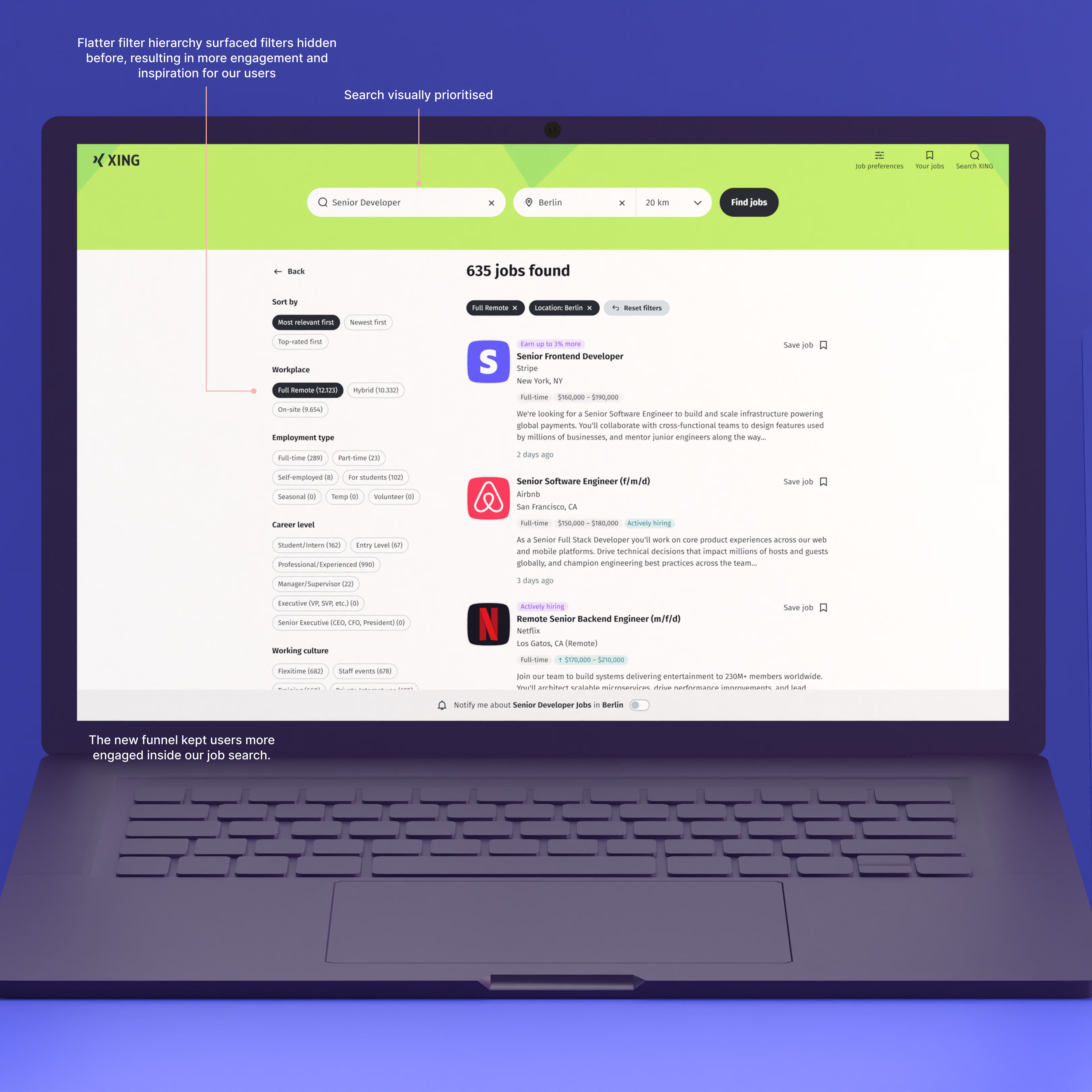
Uplift 22.9% Solution: Turn search into a focused funnel
We gave search visual priority, flattened the filter hierarchy and surfaced meaningful choices such as Remote and work model directly in the flow. Qualitative testing showed that visible filters inspired users to refine their search. Quantitative data then showed filter usage rising by 22.9%.
…to intelligence
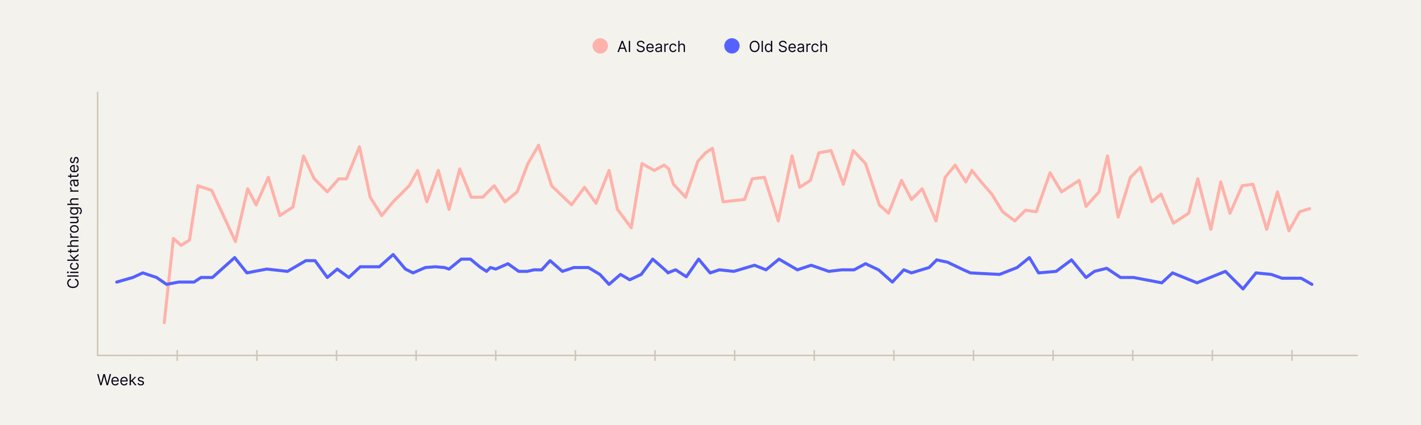
Spoiler alert: The shift to AI search worked
The move from keyword search to AI-driven discovery created a clear, sustained uplift — validating both the redesign foundation and the new search paradigm.
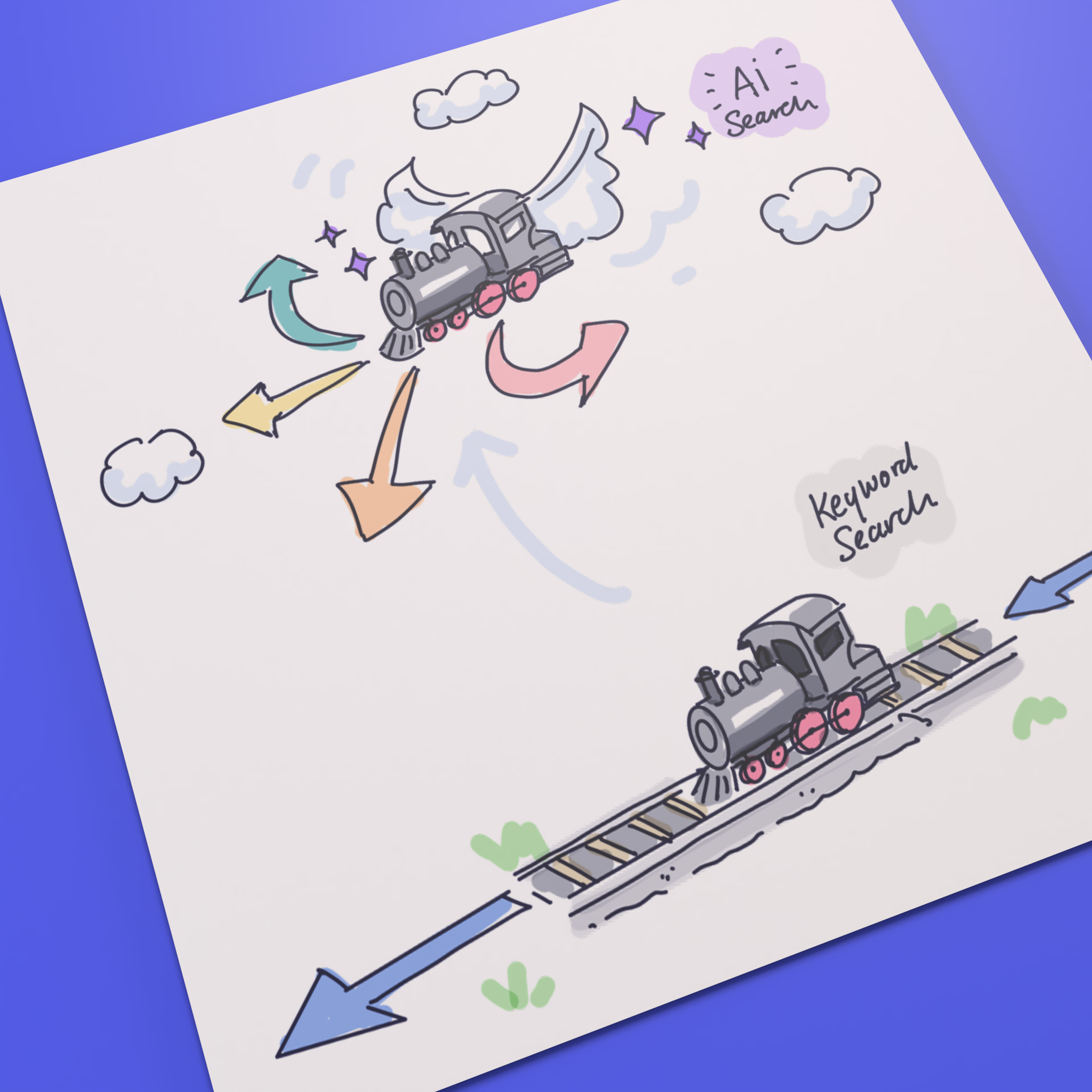
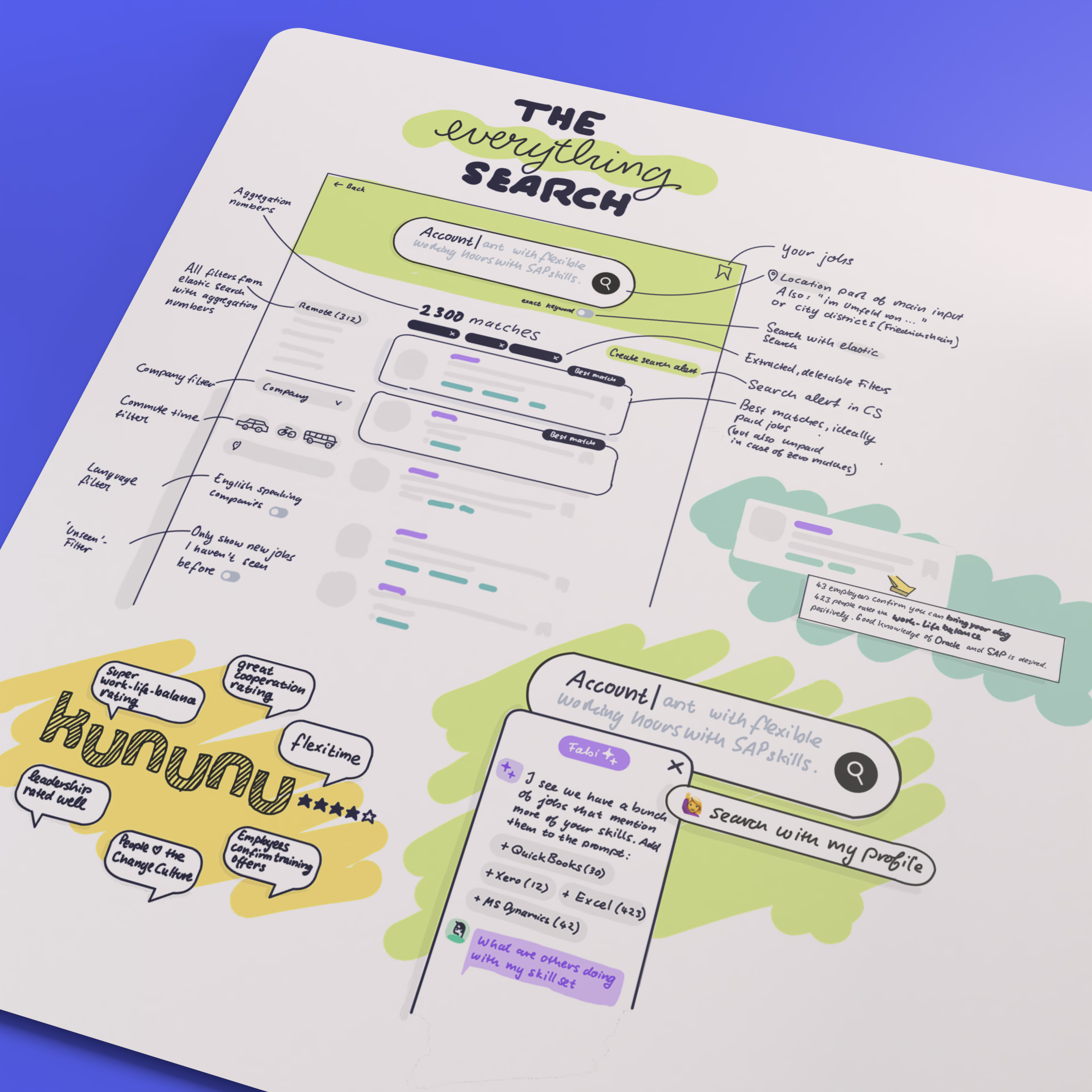
We set out to move job search from keywords to intent.
AI didn’t start with technology — it started with a question: how do people actually describe the job they want?
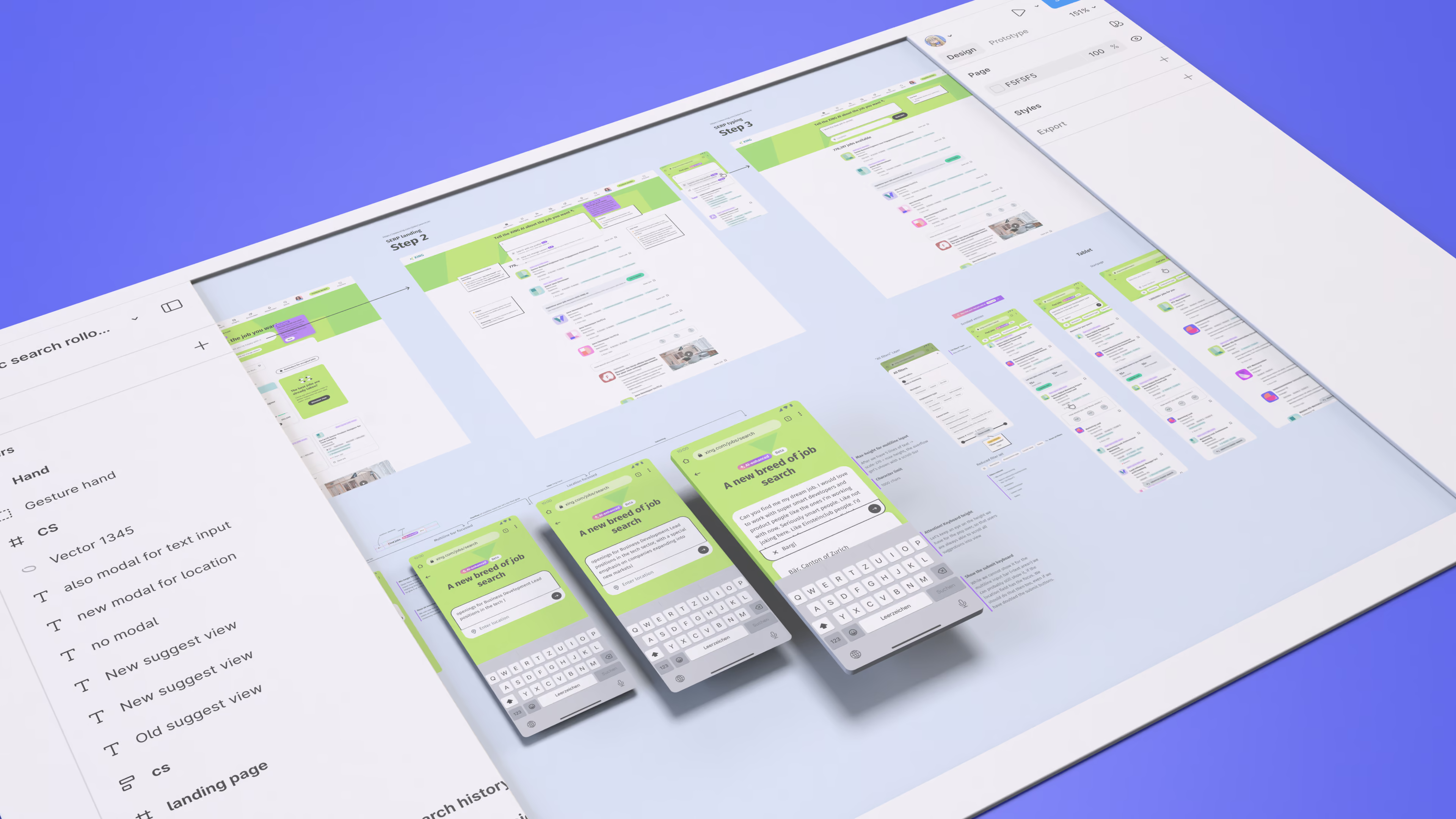
From product direction to buildable detail
I carried the search direction into detailed flows and interaction specifications, working with engineering and data science to define behaviour and take the design through implementation.
How do we help users express intent instead of guessing the right keywords?
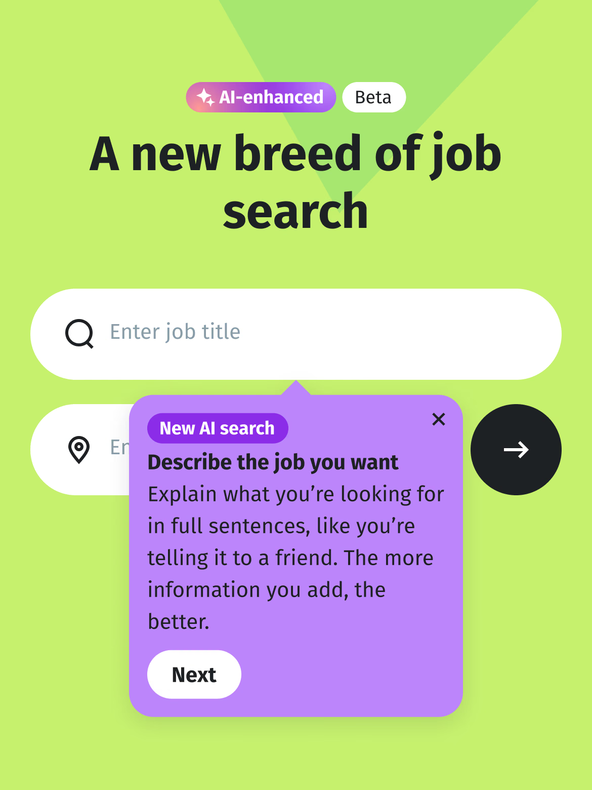
Problem: Tooltips get dismissed
Small input fields still suggested short keyword searches. But AI search needed users to write richer, intent-driven queries. Tooltips were easy to dismiss before the guidance landed.
Interactive! Solution: Help where you type
We turned the field into a larger writing area and replaced tooltips with animated placeholder prompts. The guidance appeared at the moment of use, could evolve across repeated visits, and let us surface a wider range of hints without interrupting the search flow. The result: at least 20% more users wrote longer queries.
Problem: Writing is work
We encouraged users to write more detailed, intent-driven search prompts. But creating a good prompt took effort — and that friction meant many users simply did not do it.
8% uplift! Solution: Generate the prompt
For logged-in users, we already had enough profile data to create a strong first prompt for them. Search with my profile turned that information into a ready-to-use query, increasing click-through and application rates by up to 8%.
Explaining why a job fits
Matching reasons compared profile signals with each job ad and turned the overlap into short explanations on list level. The idea made relevance more transparent before users opened a job, but did not significantly increase applications — so it remained promising, but unresolved.
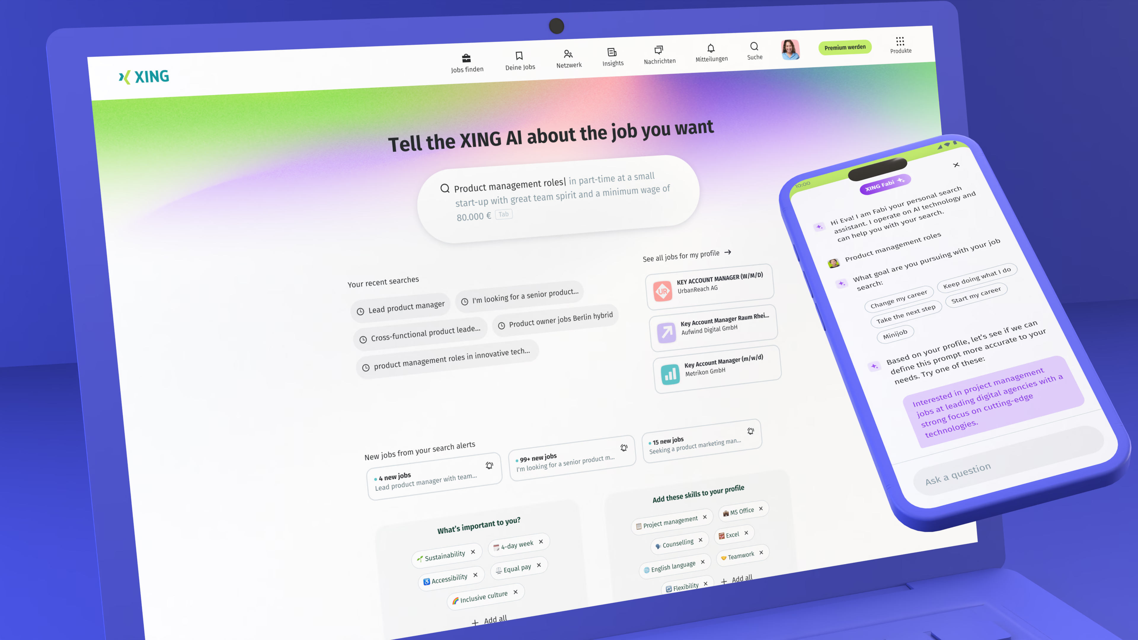
Catching the AI wave early
As AI and embedding-based search began turning from promise into product reality, we explored how the interface could evolve before the final system existed. Using internal prototypes and early embedding technology, we tested ways for users to move beyond keywords — with many patterns later shaping the shipped product.