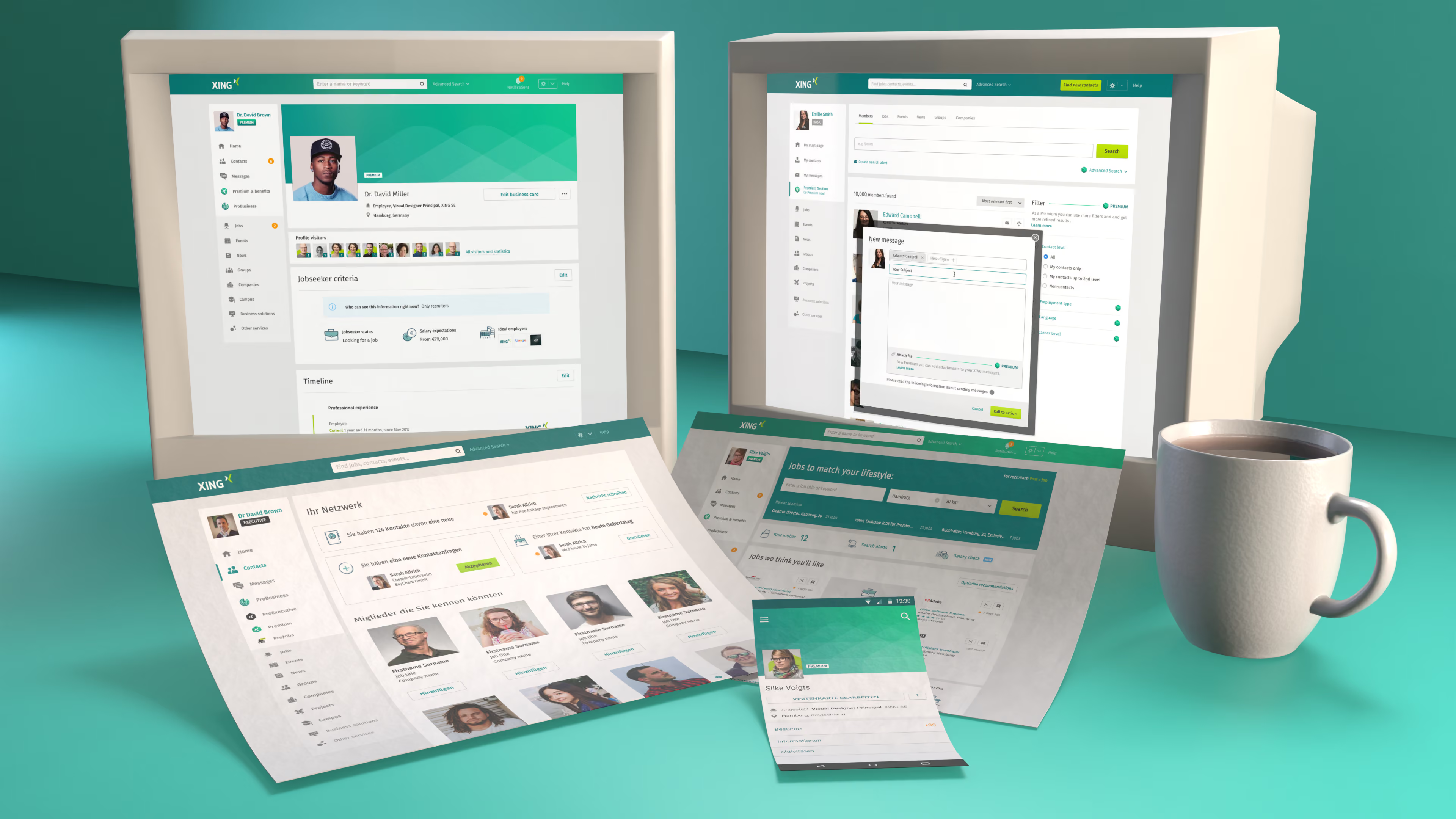
Problem: A product built from parts, not yet a language
XING’s product had grown through many modular patterns and local decisions. The interface worked, but lacked a strong visual grammar: designers had few tools to create hierarchy, express intent or guide attention with confidence. We needed a design language that turned typography, colour, shape and layout into a clearer, more recognisable product experience.
We started with a provocation
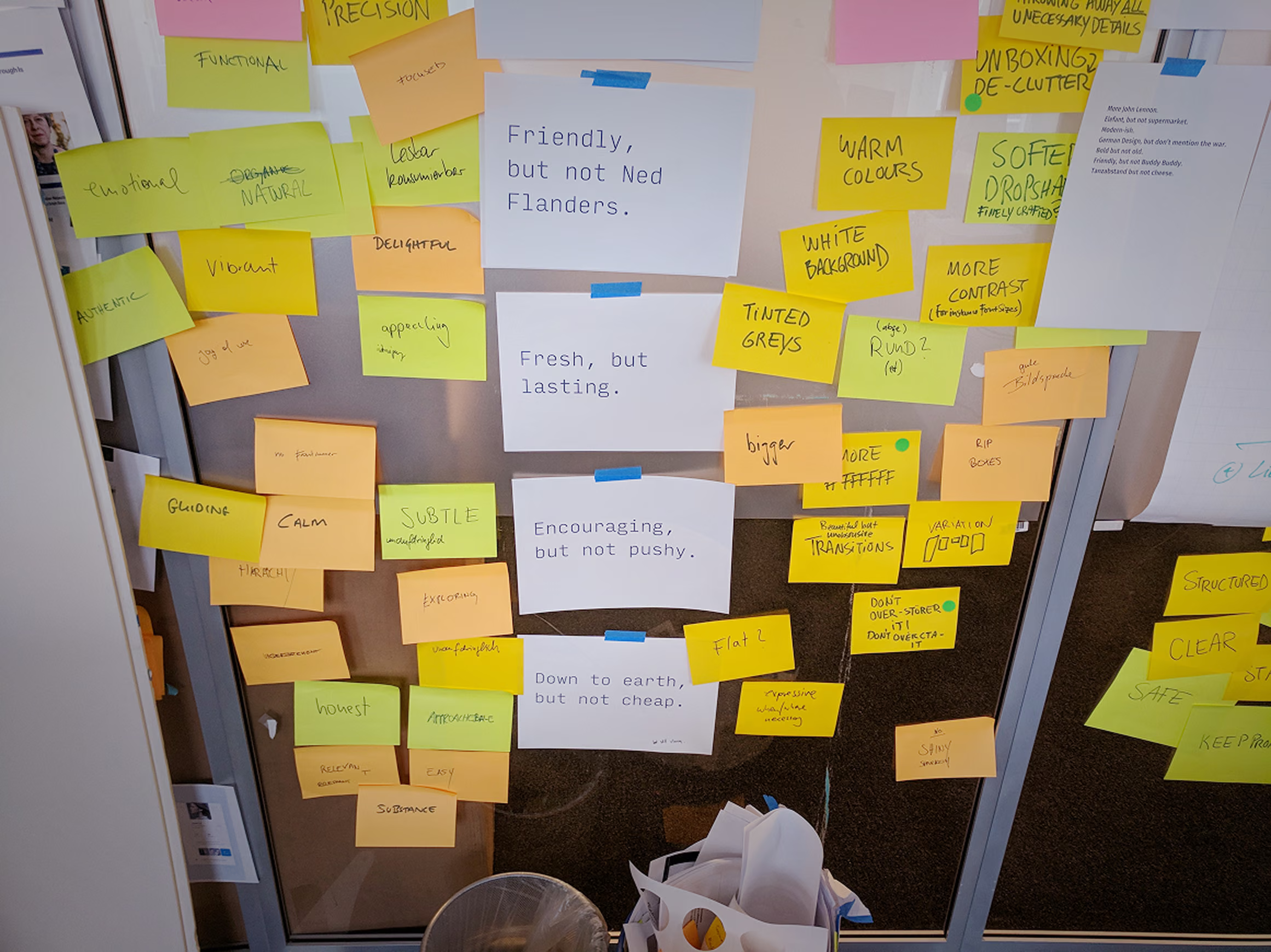
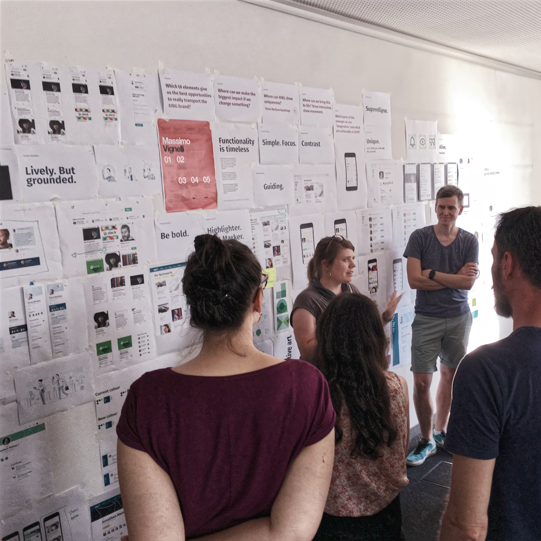
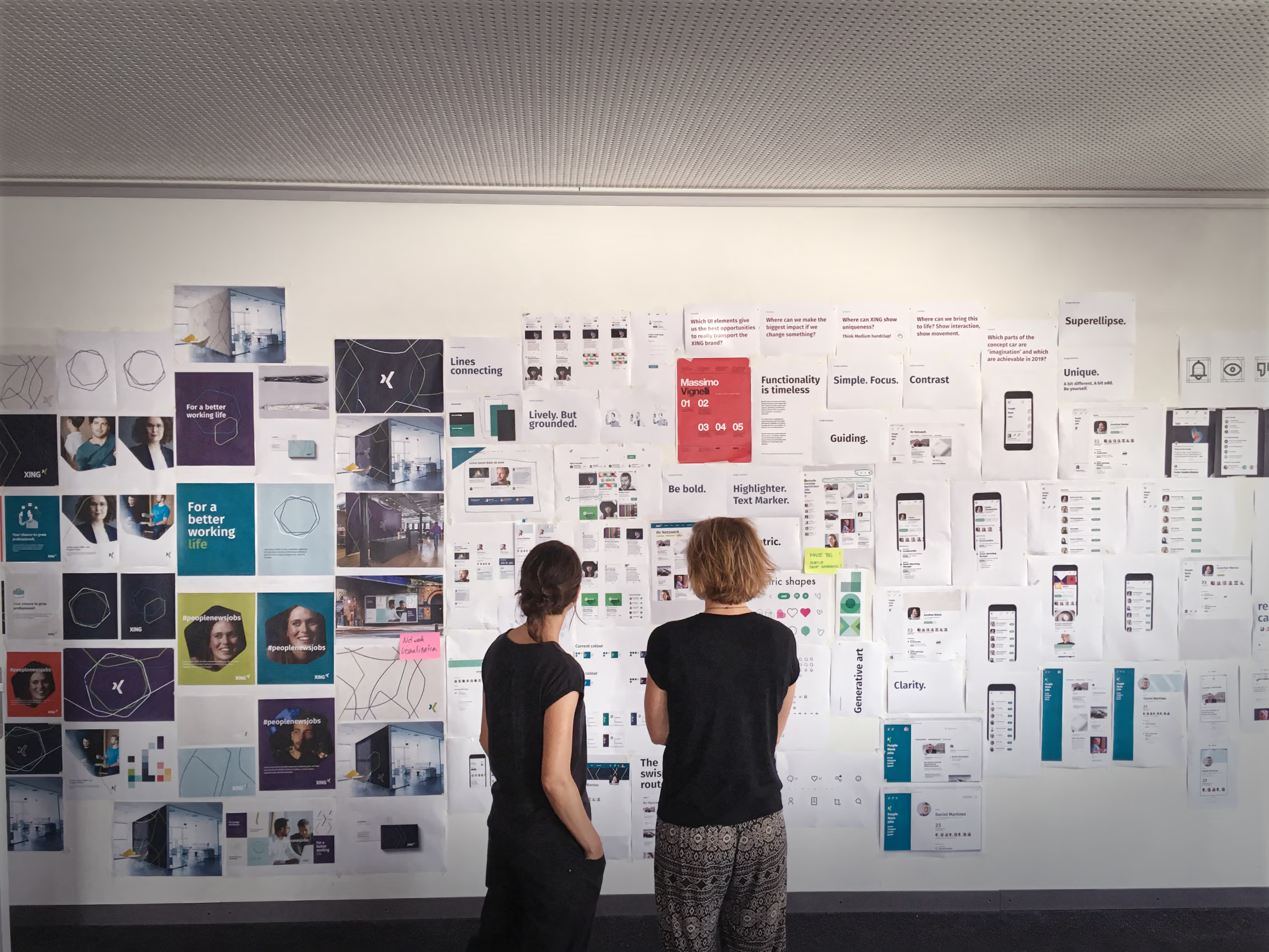
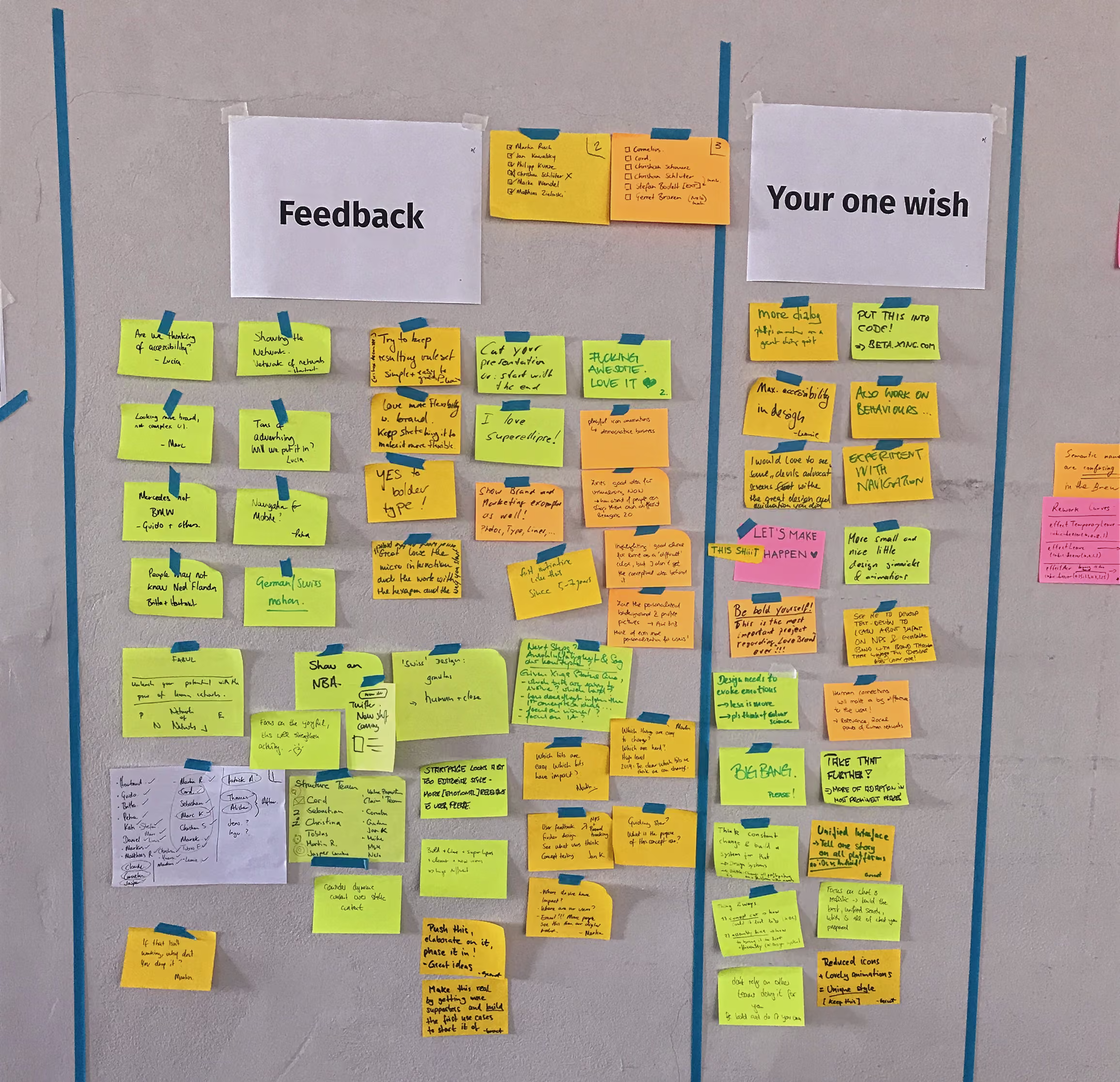
From provocation to shared direction
In a three-week sprint, we turned a Hackweek provocation into a shared product direction: what if XING’s identity was shaped from inside the product? That became the starting point for a new design language — built to carry the brand across interfaces, teams and platforms.
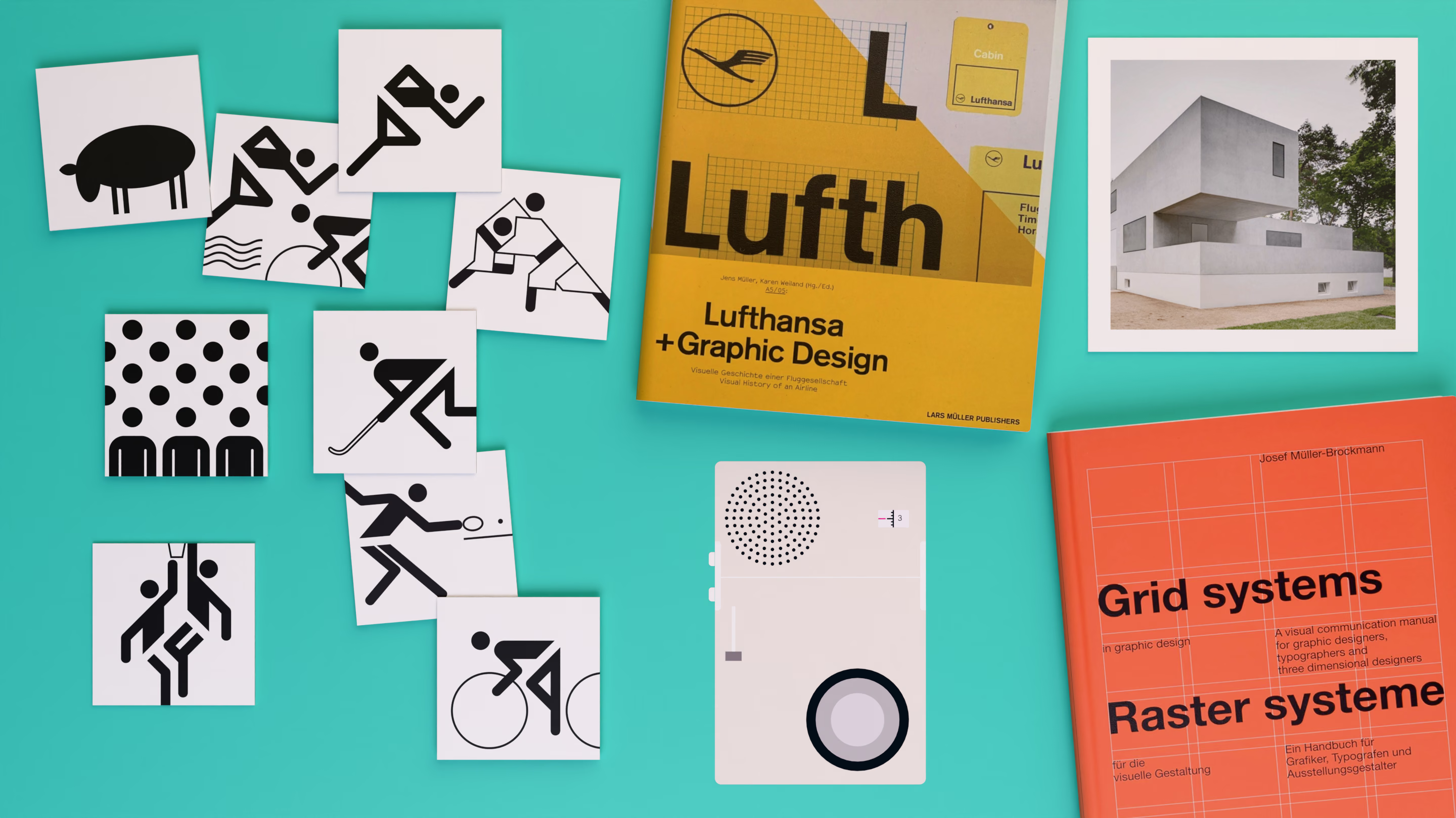
Modernist roots, product clarity
XING’s product needed more simplicity, clarity and confidence. We looked to Lufthansa, Otl Aicher, Dieter Rams and Swiss graphic design — not for nostalgia, but for principles: reduce to what matters, make structure visible, and let function become beautiful.

Built from simple shapes
We rebuilt the iconography around simple geometric shapes. Inspired by Bauhaus principles, the set became more graphic in expression and more selective in use — so each icon carries greater visual weight.
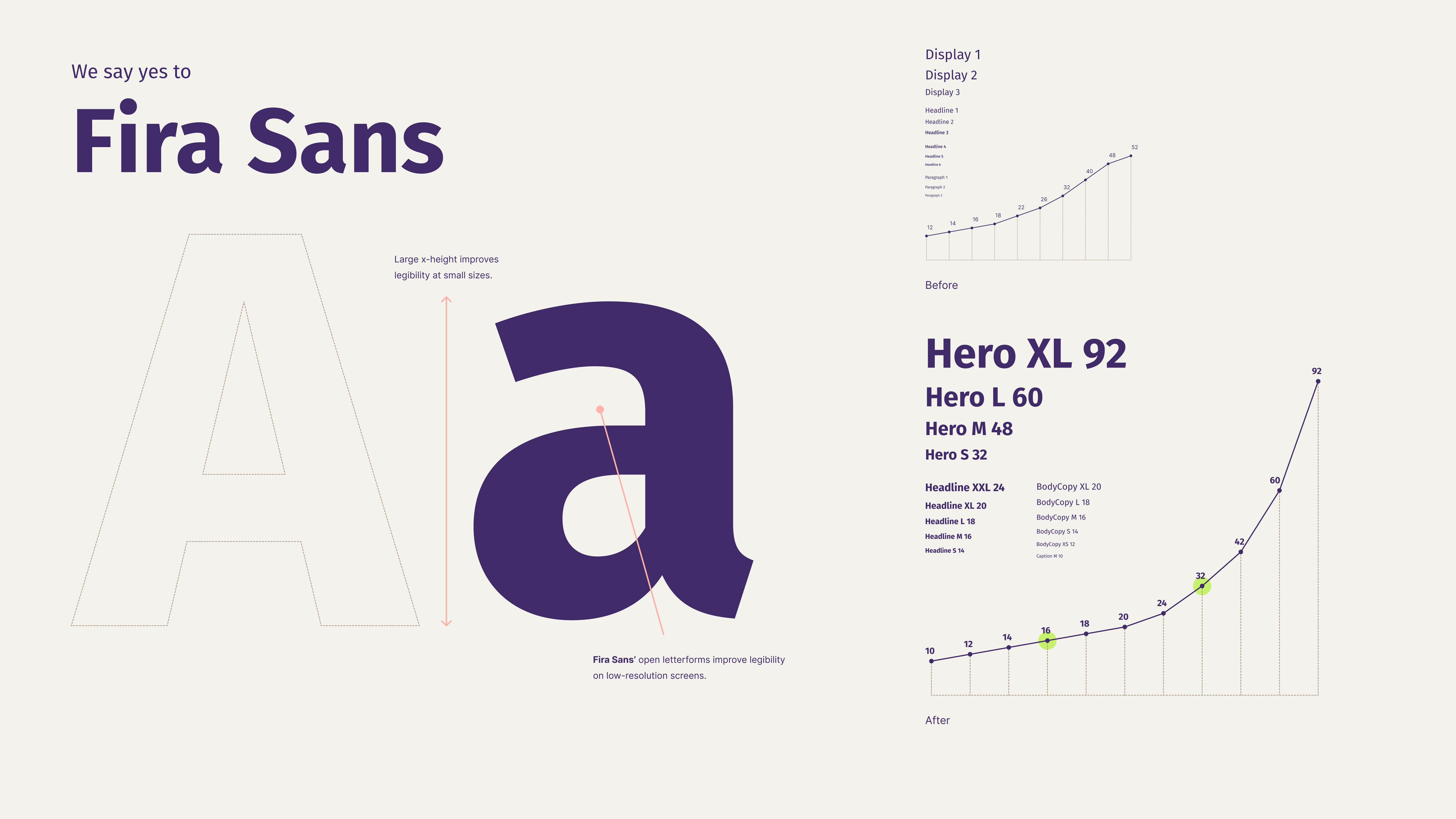
Typography became a stronger tool for hierarchy.
We rebuilt the type scale around a more expressive curve, inspired by modular systems like IBM Carbon — with precise steps for small text and stronger jumps for large headlines. Clear usage guidance and bold weights helped designers create consistent hierarchy, stronger contrast and clearer information islands.
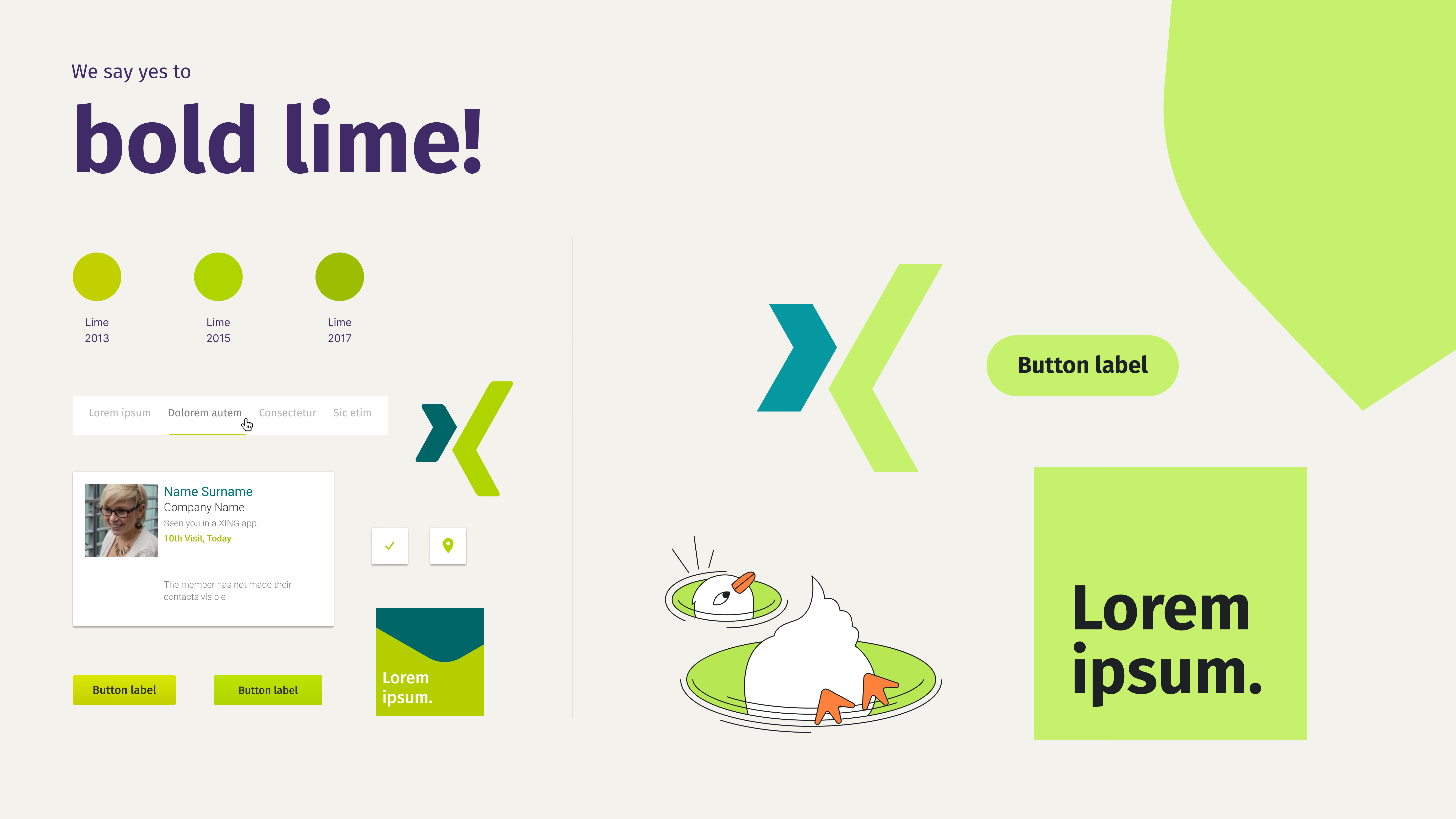
Turning a usability problem into a bold design statement
XING’s bright lime was distinctive, but it had been darkened in product UI to make it work for text, lines and controls. We restored the colour as a fresh brand signal — then defined stricter usage rules so it could create energy without carrying accessibility or readability it was never meant to handle.
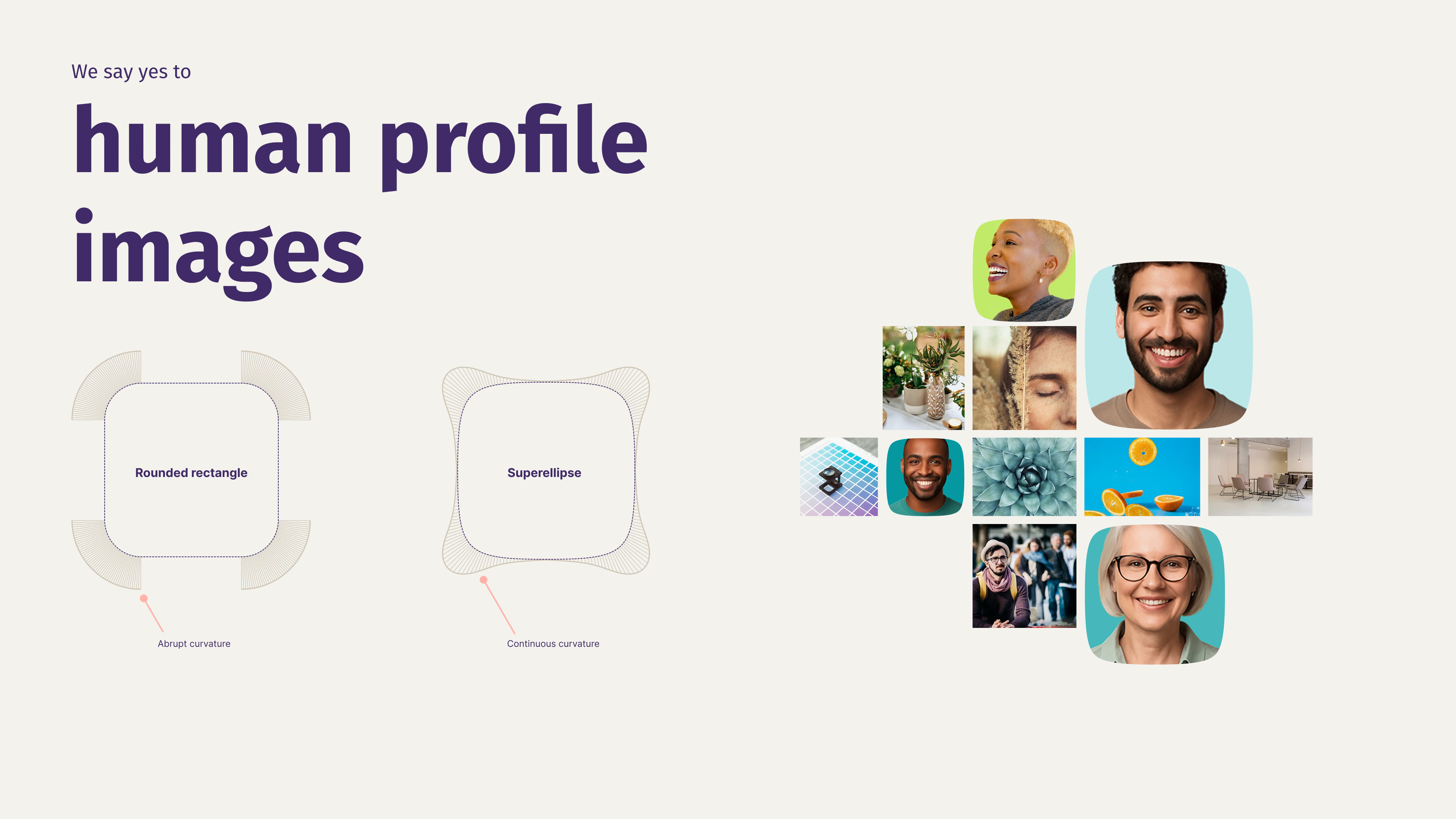
Softer shapes for people
We used a superellipse mask for profile images. Its continuous curvature feels softer and more natural than a rounded rectangle — giving people’s images a more human presence.
Our design philosophy: simplify always
The new design language brought the clarity we had hoped for. We removed unnecessary boxes, lines and visual noise, so every remaining element had a clear purpose. Stronger typography, sharper contrast and deliberate use of lime helped guide the user’s eye — making the product feel calmer, more focused and easier to understand at a glance.